Hey there! What do you think of my new ‘digs’?
I’m seriously in love. I didn’t know it was possible to be in love with a website . . . but I am. And it’s mine, all mine.
I still have some tweaking to do and it’s going to take some time but it’ll be so worth it. Projects and paintings will be much easier to find for you . . . and me too! After blogging for 5 years, there is quite a bit of content here and it drove me crazy trying to find stuff. Pretty soon though that’ll all change.
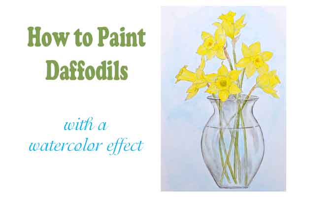
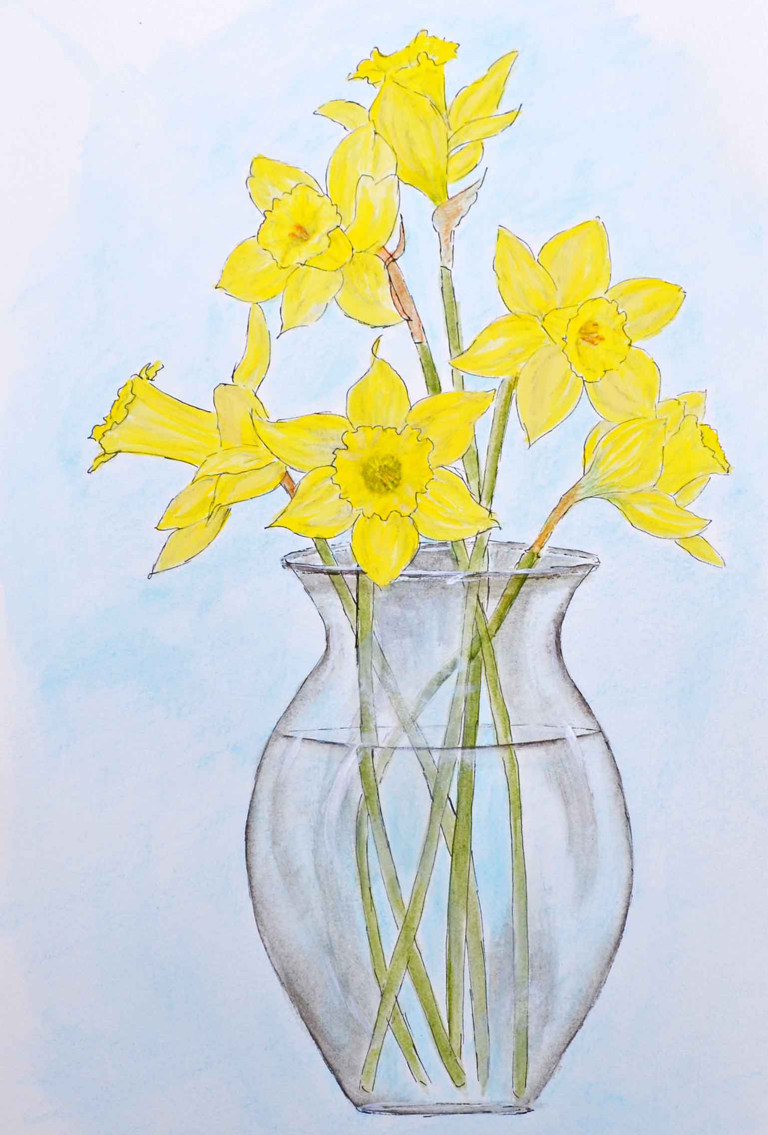
So in honor of my new design, and in honor of Spring (that surely is coming sometime soon), I thought a daffodil painting tutorial is in order.
Aww . . . daffodils. Bright. Cheery. Sweet-smelling.
Well, I can’t bring you the sweet-smelling part but I can bring you bright and cheery. So let’s get started!
Materials List
Paint – (by FolkArt)
- Daffodil Yellow
- Lemonade
- Italian Sage (grey-green)
- Clover Green
- Medium Grey
- Wedding Cake (by Martha Stewart)
- Watercolor Pencils
- Watercolor paper
- Daffodil pattern
- Graphite or transfer paper
- Fine tip permanent marker
After you download and print the pattern, transfer it to your watercolor paper, then outline the entire pattern with the marker. You could skip this part, paint first and outline afterwards, if you want. I find it easier to outline first.
Now, to achieve a watercolor effect we’ll use a fairly damp paintbrush. Not drippy wet, but maybe a 50:50 paint/water ratio. Start on the lighter side and you can always add more paint if you need to.
For the stems, load both Italian Sage and Clover Green on your damp brush and lightly paint the stems.
(I didn’t take any close-up pics of the stems because I didn’t really think this would be a tutorial when I was painting. Sorry ’bout that.)
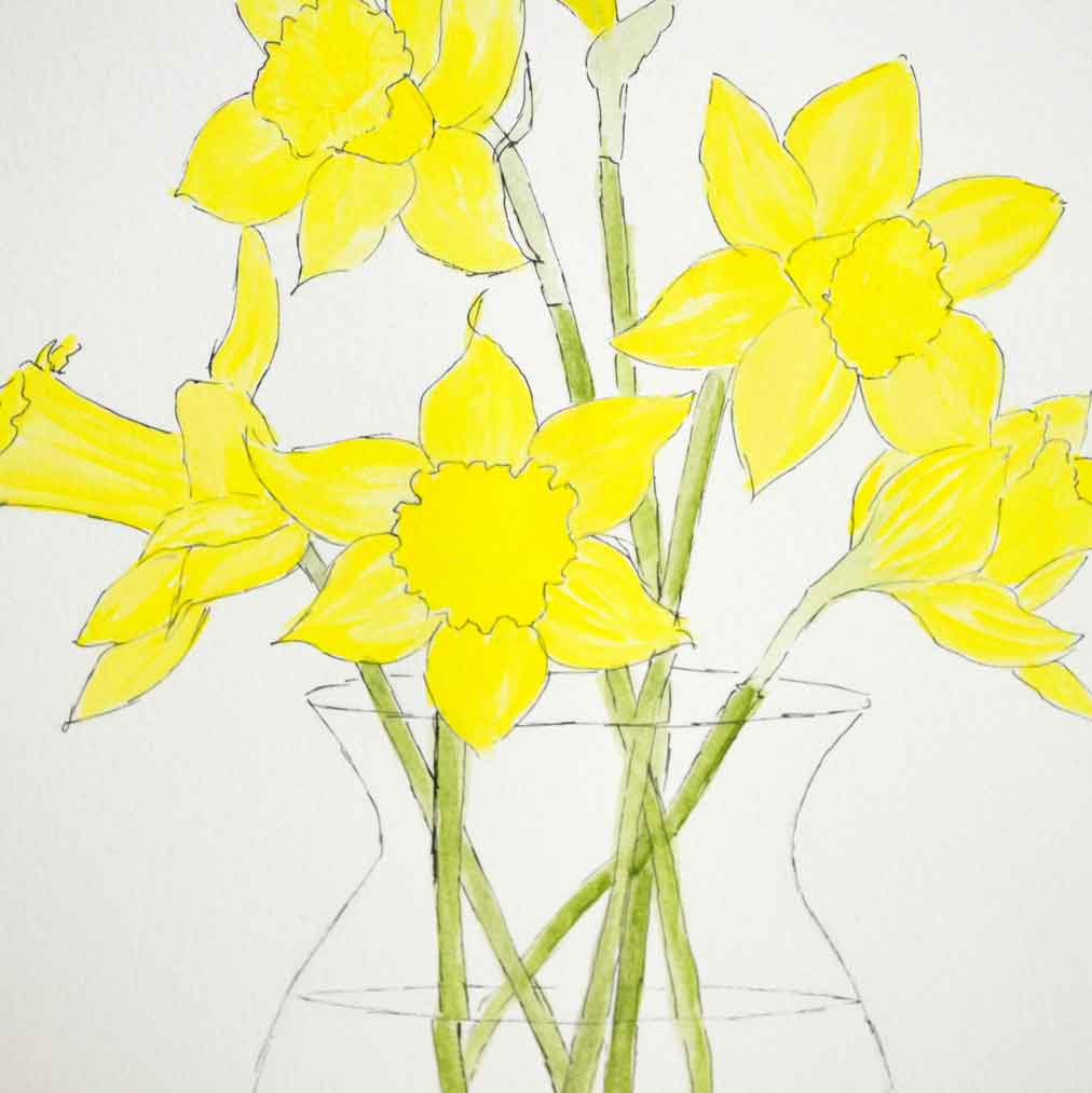
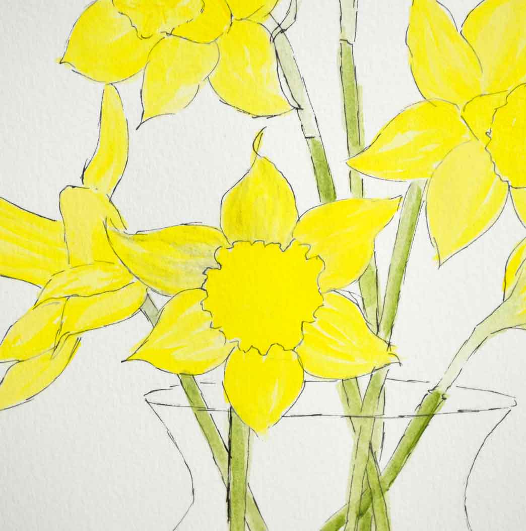
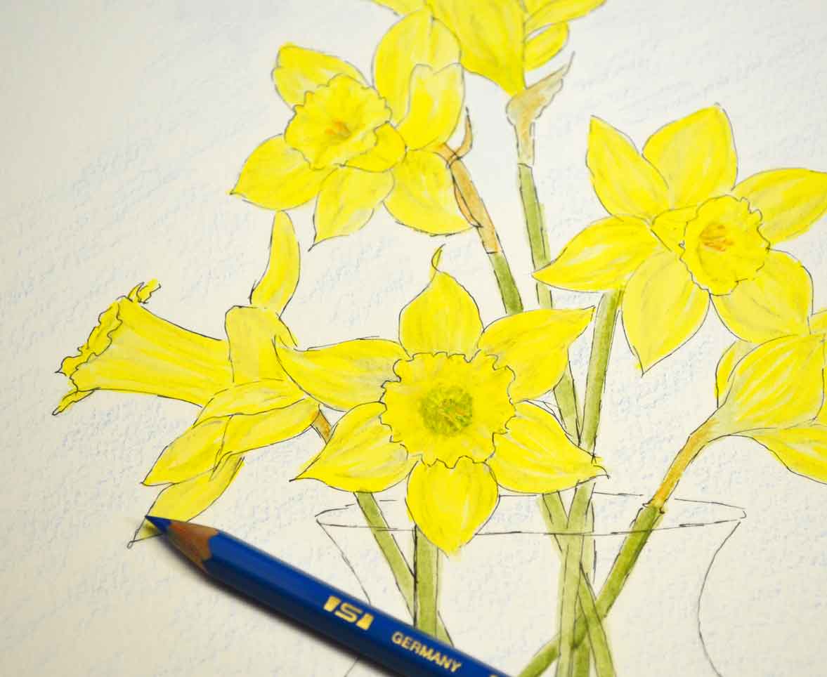
For the blossoms, paint a light coat of Lemonade. In the photo above, the daffodil right in the center is painted with Lemonade. Notice how light it is compared to the others.
This particular variety of daffodils are all yellow. No orange or white. So we have to find a way to add detailing and dimension and still make them look like the flowers are all one color. By starting with a pale, light color, we can add depth with the same color, and a color close in value, as in Daffodil. (The paint color, I mean.)
Next, pick up some Daffodil color for the center and lightly – very lightly – for the leaves. Rather than cover the entire leaf with Daffodil, let some light spots show thru.
Of course, if you cover the entire leaf, no worries. Truly, it’s pretty hard to mess up daffodils. They’re just so dang happy!
Now . . . we need to add some dimension.
I’ll be honest here, this took me a while to figure out.
Look at the blossoms . . . all the same color yet full of ruffles and ripples.
Hmm . . . .
So I googled. “watercolor daffodils”. “how to paint daffodils”. “daffodil paintings”. Usually I can find something I can ‘borrow’, play around with and then make it my own.
Not this time. This time, I had to just experiment.
Good thing I have plenty of ‘weapons’ in my arsenal!
I chose a grey watercolor pencil.
If you haven’t tried watercolor pencils yet, you’ll love them. Especially if you like to sketch, like I do.
You can either sketch with them, leave the piece looking sketchy, or you can take a damp paintbrush and blend the pencil strokes into a watercolor look.
This is pretty subtle, compared to the photo with the pencil marks but that’s what I wanted – subtle. The grey adds just enough shading to create some depth, but not too dark.
I could’ve used light grey paint, of course, but to get fine lines, a pencil works wonderfully.
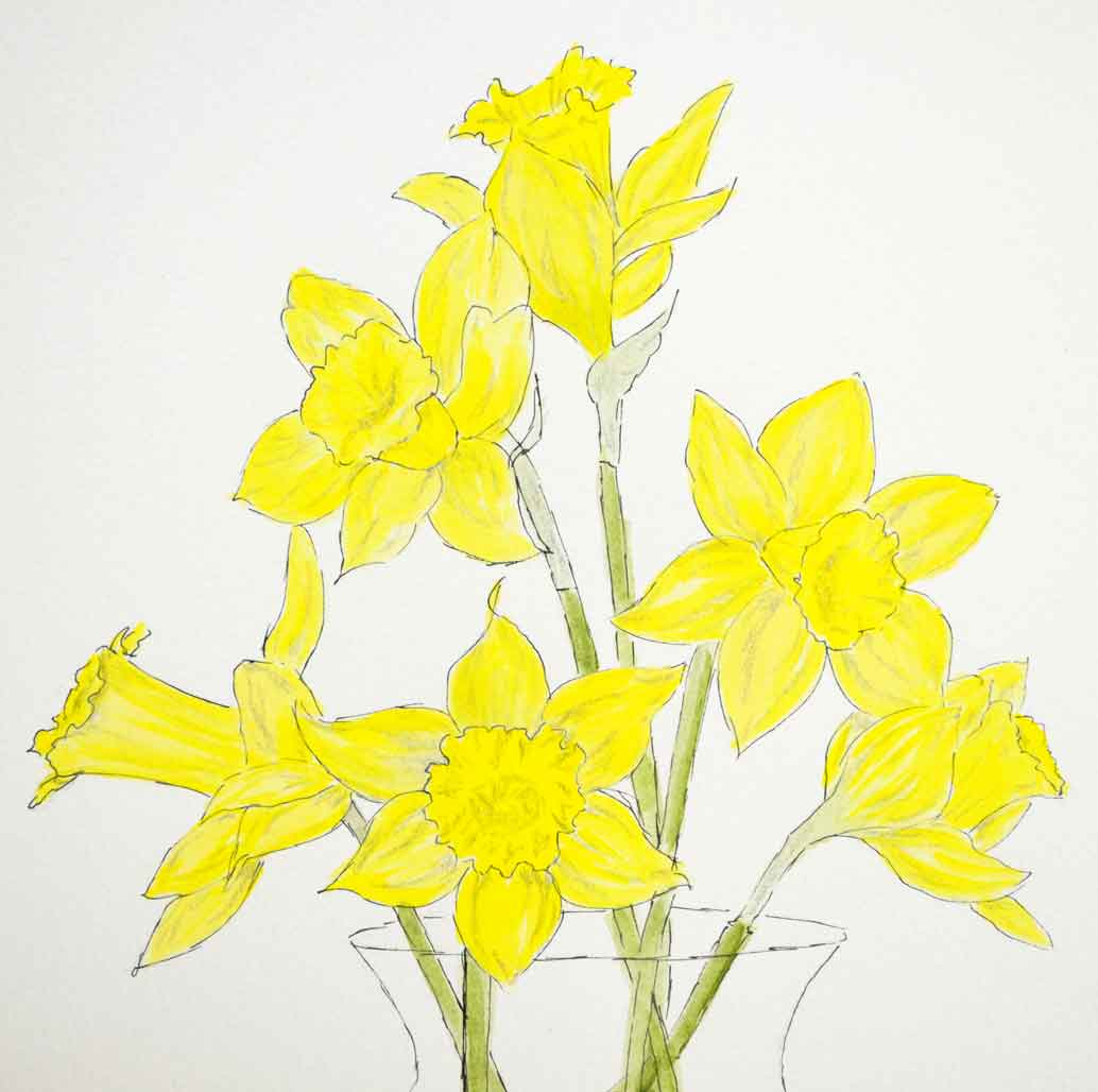
Here are all of the blossoms with just pencil markings, before I blended them with a damp brush.
It’s so subtle that it’s hard to tell if some have been blended or not, but that’s just fine.
Now, I rarely do watercolors . . . mainly because I haven’t a clue how to . . . but I love the look of watercolors. So when I decided a light blue background would set the yellow daffodils off nicely, I wasn’t quite sure (again) what to do.
Turns out, a watercolor pencil made it really easy to get into the tiny spaces between the flowers. Just rub the pencil on the paper and go over it with a damp brush.
Hmmm. Too pale maybe?
So just add more color and repeat . . .
Much better.
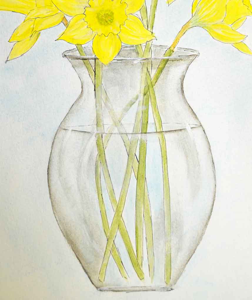
For the vase you’ll need a medium grey and some white.
I’m not gonna get into a whole tutorial about painting clear glass right now (I will soon though). Basically you need to softly outline the vase with grey.
Softly softly. If you know what I mean. As in, dilute the grey, stroke it on, then stroke it some more to soften it even further. You want just a suggestion of color.
Glass is clear, remember. So what you’re painting is either what you’d see behind the glass or reflections.
Or, what I do is, simply paint some lights and darks, allowing the stems and a bit of the background to show thru.
Once you have some grey painted, then the white will show up. However, I found it difficult to get the normal “pop” of white I get when painting with acrylics full strength.
Still . . . I’m willing to trade that in exchange for exploring a watercolor effect. By no means do I come close to having it mastered, but it sure is fun and very relaxing, as well as pretty fast.
I know I don’t even have to ask if you’re ready for Spring. Who isn’t?!? If you’re still stuck in snow, then give these daffodils a try. (Even if you aren’t, try them!) They’re the perfect way to brighten your day, imo.
Colleen






I am going to have to give this a try. I have yet to get painting daffodils down but I may if I keep practicing. Love the new layout of your blog/website.
I know, Pam. Daffodils have been tough for me too, which is why I went a totally different route with watercolor stuff. The grey WC pencil adds just enough depth, I think.
Let me know how you do. And thanks!
the new digs are so fresh and clean looking. Like it a lot
also, I finally began painting daffodils upside down just as with faces to get them right.