When the wonderful people at Modern Masters asked me if I’d like to review some of their products, I knew exactly what I wanted to paint – a floor screen I got at the thrift store a while back.
I’ve always loved floor screens, or room dividers as they’re often called. I couldn’t believe my luck when I spotted this one, even though it’s present ‘style’ wasn’t exactly my taste.
When I shop, I generally look for things I will eventually paint anyway, so color and style doesn’t concern me.
Price, however, does.
I was pretty sure this screen was mis-marked. Ten dollars seemed a little too reasonable, even for the ‘best thrift store in the world’.
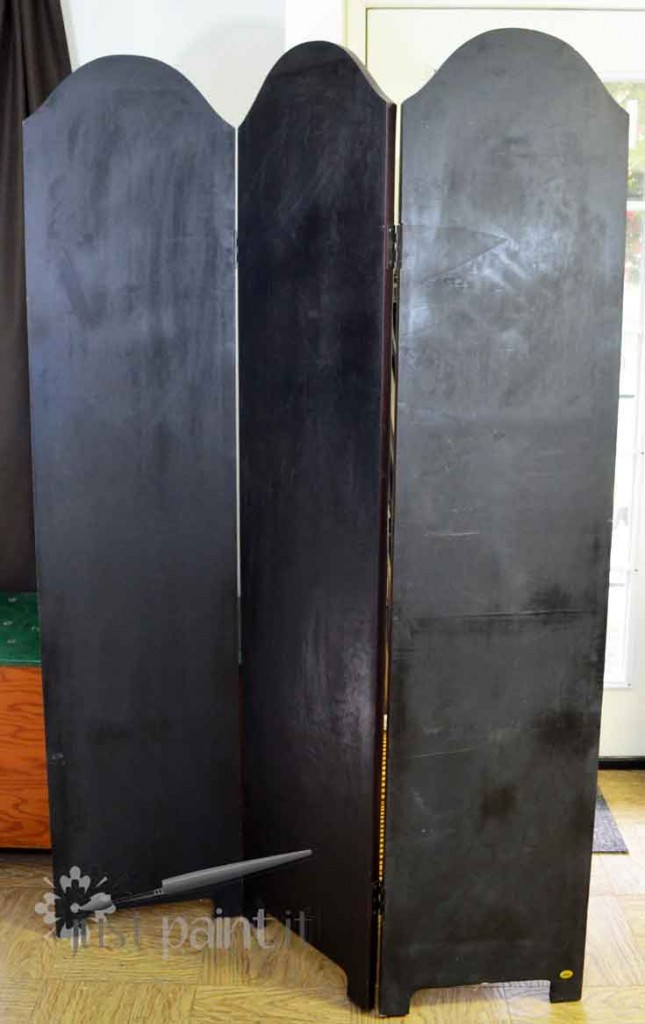
Closer inspection showed justification for the low price.
The tear didn’t effect the screen’s overall stability so I brought her home to add to my collection of Things To Be Painted.
And there she sat until I needed some sort of display for my Dollar Store Christmas Wreaths.
I flipped the screen around so I could have a plain surface without pattern, and just kept this side facing out until I received my Happy Mail from Modern Masters.
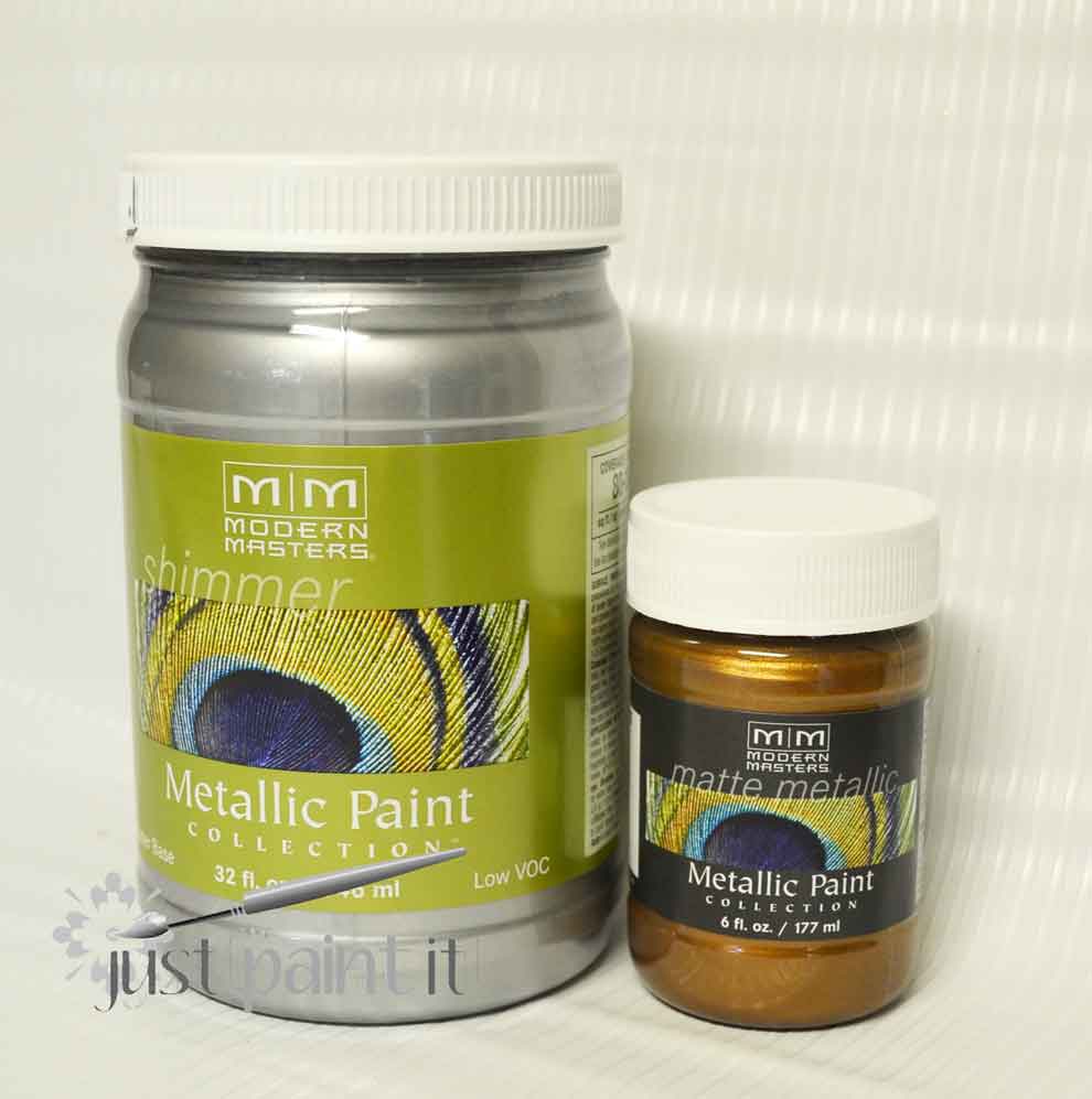
I had already fallen in love with the matte metallic in Antique Bronze when I dry brushed my mother’s outdoor fountain.
I couldn’t wait to try this Silver shimmer.
Coming up with a design, however, took some time. Which is pretty typical. I think I spend more time researching and designing than I do actually painting.
I was pretty set on Art Deco, sort of the old Hollywood feel. Glam. Luxe.
Or, I should say, what I thought was Art Deco.
As I was googling “Art Deco screen” I was also seeing a lot of “Art Nouveau”, which looked similar, yet different.
At the time, I didn’t care what the style was called . . . I just wanted a design for a $10 screen that called for a lot of shimmery silver.
As I googled, I saw lots of geometric patterns.
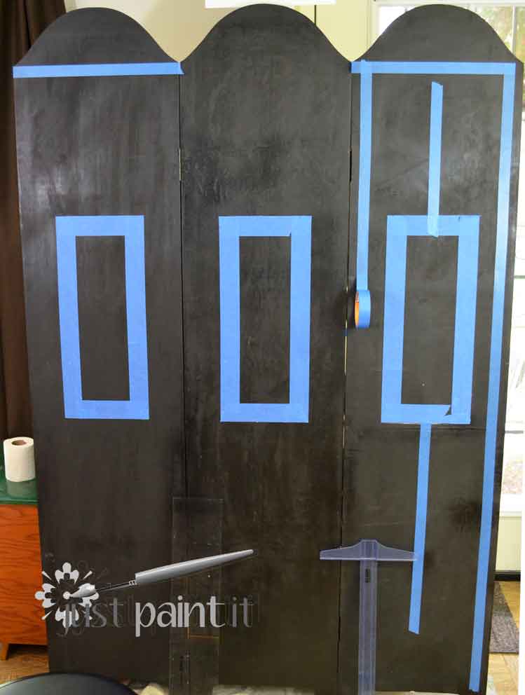
I drew a simple sketch with some rectangular patterns and grabbed my painter’s tape and rulers.
Rulers are a must, as I’ve learned thru the years that painter’s tape is no substitute for accurate measurements.
Once I had a few lines and rectangles laid out . . . fairly accurately . . . it was time to roll on the silver.
Ahhhh . . . divine.
The closest comparison I can think of is liquid gold. Which, of course, it isn’t.
No, it’s silver. Dreamy, luxurious, shimmering silver.
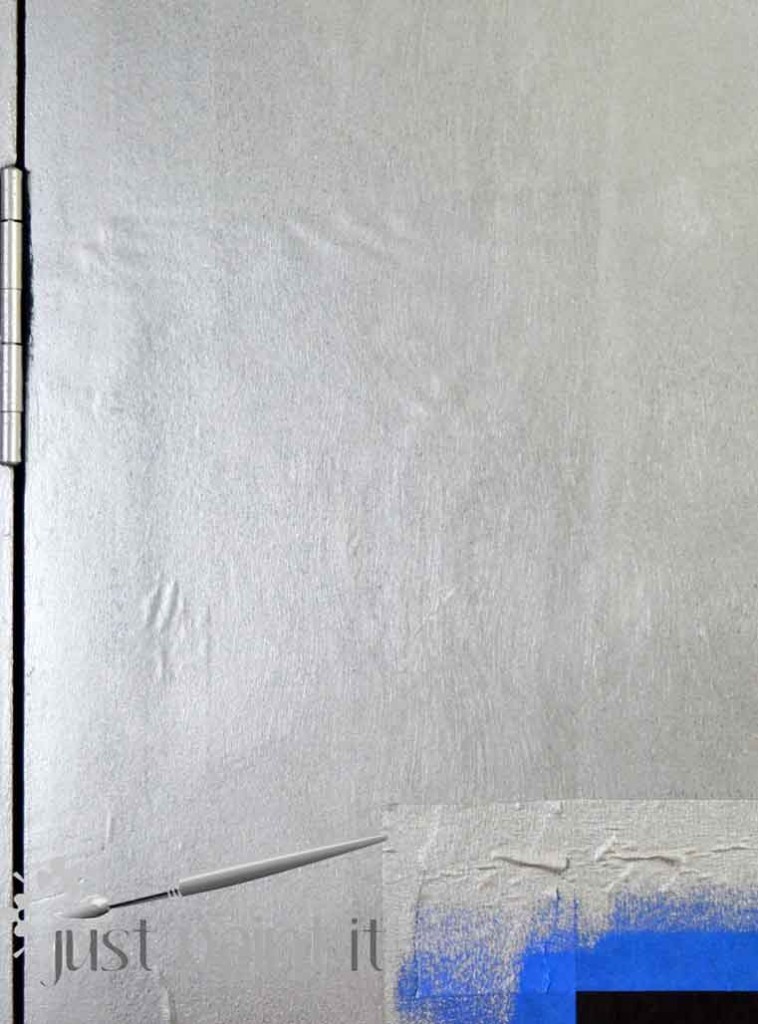
It rolls on like a dream. It covers unbelievable well, even over the dark brown on the screen. I did use two coats, only because I thought perhaps some of the brown would seep through when the silver dried.
It didn’t.
The coverage is superb. Of course, applicators make a difference in paint coverage – bristle or foam – and how you personally load the paint will affect the overall coverage too.
For a metallic, however, I think it has great coverage, especially since I’ve always had to apply a layer or two of matte color, close in shade to the metallic topcoat. With Modern Masters, this wasn’t necessary at all.
For the Silver or the Antique Bronze, which I brushed into the squares and rectangles.
It’s a little difficult to get the true sheen of the metallics in photos, unfortunately. And lighting plays a role too. The Silver just gleams. Truly gorgeous. And the Antique Bronze is pretty, yet different than any other metallic I’ve ever used.
And I’ve used a few metallics, but always craft or spray paints.
The bronze is what they call “matte metallic” with a lovely sheen but not as sparkly as the silver, so as not to upstage it.
Modern Masters combine real metal particles, pearlescent pigments and traditional color pigments to create these wonderful paints. And their choice of colors is amazing. All are non-tarnishing so they can be used in a myriad of projects.
Did I mention they’re water-based? No kidding. Clean up is a breeze.
Once the bronze dried it was time to add some artsy stuff. Originally I had planned on just using painter’s tape to create all sorts of geometric patterns. I kinda wish I’d tried that.
I just don’t have the patience for all of that taping and measuring.
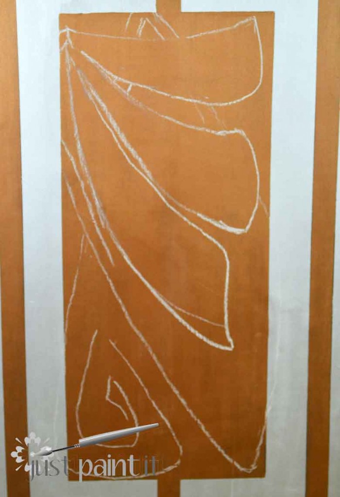
Instead I used chalk to draw on an Art Nouveau-inspired flower.
Different than Art Deco, mkay? We’ll get to that in a minute.
Anyway, using chalk on a tall vertical surface took me back to my mural painting days. I actually missed them . . . for a minute or two. I don’t miss the climbing up the ladders and crawling around on the floors.
One tip about chalk that I recently learned – wet the chalk for a minute and then sharpen it in a pencil sharpener. A regular ol’ sharpener. You’ll get a nice point on the chalk to draw with. Very nice.
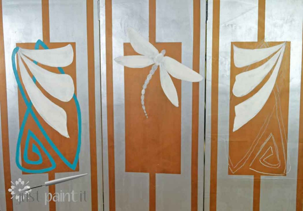
The white is painted with Chalk Paint I had left over from my desk makeover. The turquoise is a craft paint enamel.
Note to self: Painting a three paneled screen is like painting three separate pieces. As in, this took a lot longer than I’d originally anticipated.
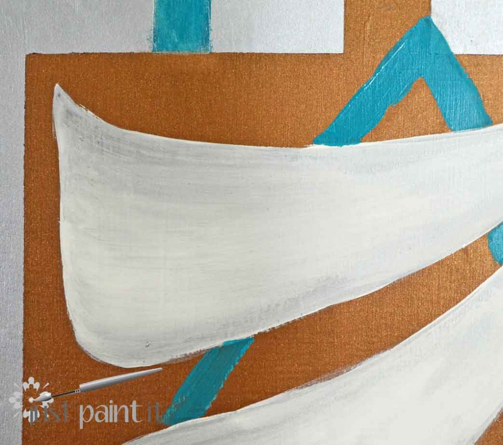
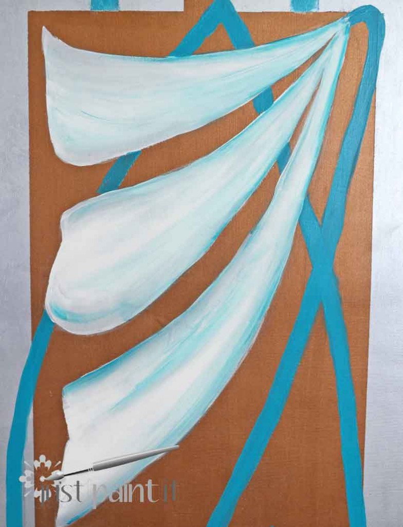
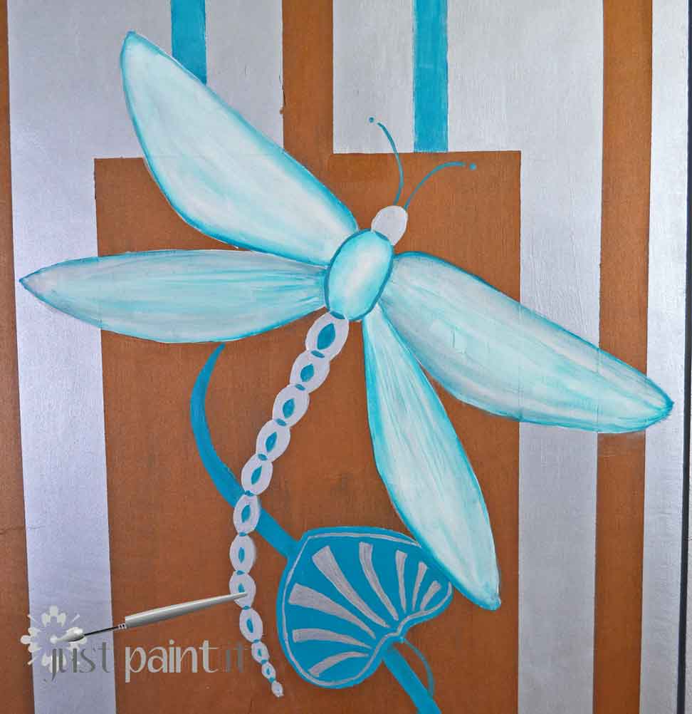
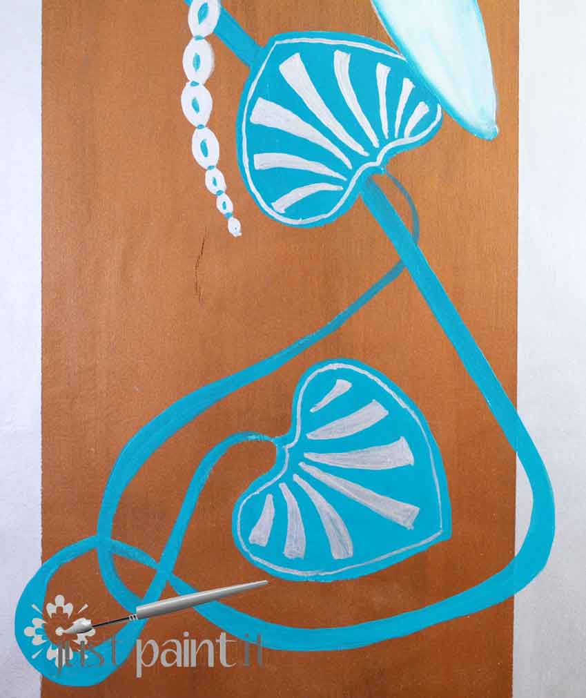
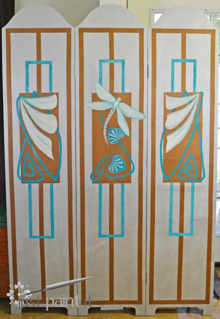
I drew this all freehand as I didn’t want the flowers to be perfectly symmetrical. I had wanted a dragonfly in the center from the very start, but finding two complementary pieces to surround it proved a little tougher than I thought.
It all seemed a bit disjointed at this point. Meaning – I didn’t feel like working on it for a while. So I just left it along, peeking at it every time I’d walk past, waiting for inspiration to hit.
(Truth be told, there were a few times that I thought about painting it all out with silver and grabbing the painter’s tape.)
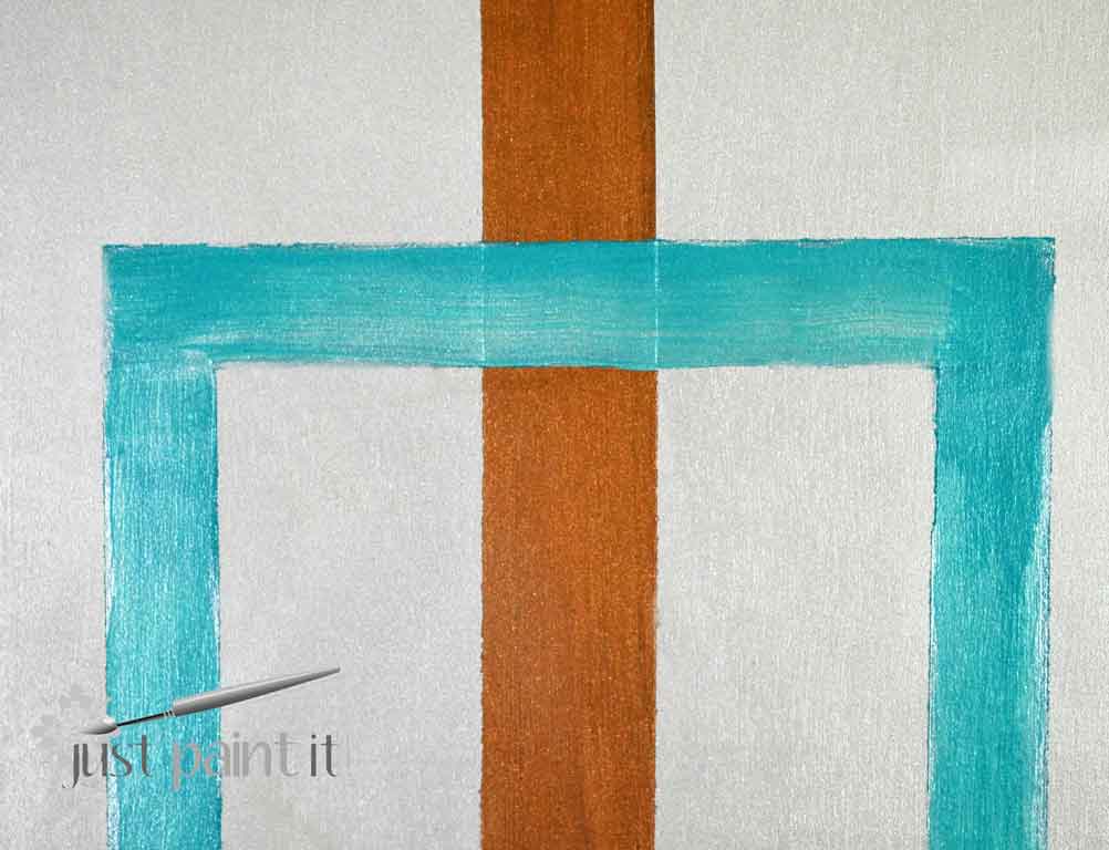
Which is actually what I did. I just didn’t paint the whole screen out. I had picked up this thinner tape in the auto section (made by RustOleum) when I was planning the geometric pattern.
I grabbed the tape but not the ruler. (Lazy much?) I thought I’d at least try to create three rectangles by ‘eye’. Just to see. (pardon the pun).
Plus, a ruler wouldn’t have done much other than provide aggravation because I know all of my lines and boxes are not accurately measured or plumb. Trying to line up more lines would’ve been an exercise in frustration.
Frankly, those come naturally. No extra help needed there.
After taping out the lines, I taped around the orange tape with blue painter’s tape, then removed the orange.
A rare pretty-good-thinkin’ moment.
Then I painted inside the blue tape. I wish I could say that this went swimmingly.
Um . . . no.
I had some dark turquoise craft enamel and some light turquoise metallic craft paint. And I’d been painting with the beauteous Modern Masters metallics.
My entire review for Modern Masters gelled in my mind as I battled with the craft paints, trying to create the sheen I wanted.
It took a few times and I finally wound up mixing the craft enamel and metallic to get a halfway decent sheen.
Trust me when I tell you, for any nice pieces I will be using Modern Masters, not craft metallics.
I learned my lesson.
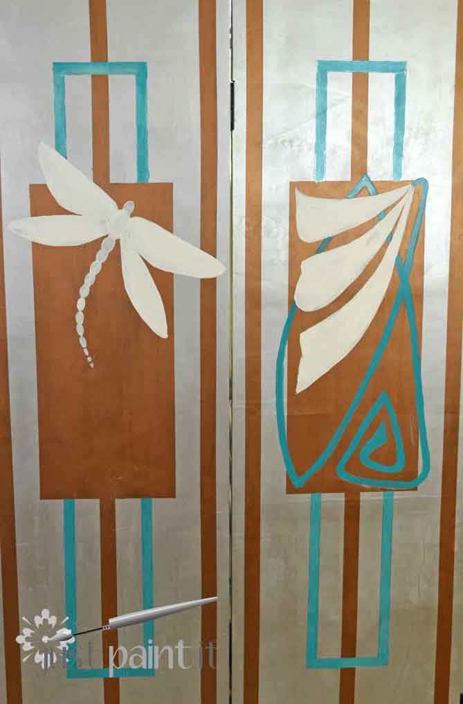
The flowers got a light wash of silver, using some glaze mixed with a smidgen of paint.
And then a turquoise glaze to work back to the similar tones in the screen.
The same with the dragonfly, although I might eventually add sections to the wings . . . kind of a stained glass approach . . . to make it more graphic.
We’ll see.
On a whim, I tried my hand at these little guys. I don’t know what they’re called but you see them a lot in Art Deco . . . which I thought this piece was.
So . . . it turns out that there is a difference between Art Nouveau and Art Deco.
While I’m far from an expert, I’m guessing that this screen has a little of each style.
Perhaps I should google more than just images when I start a piece . . . as opposed to after I’m finished painting.
The funny thing is, I found this excellent article that draws comparisons on the two styles on Fauxology, my friend Regina’s blog. She no longer writes that blog as life has taken her to new heights but Fauxology is a fabulous blog, full of all sorts of painting and interior design posts.
Not to mention art nouveau and art deco.
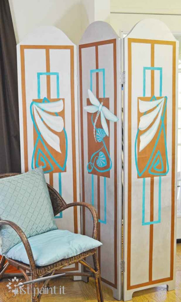
As I said, I’ve always loved floor screens, aka room dividers. They provide opportunity for some artwork as well as a good camouflage for excess storage in, say, a craft room.
I also love the way the colors play out. The silver is just . . . stunning. The turquoise works back to everything else in the room. And the antique bronze is a great complement to a lot of the wood tones. A little glam, a bit of luxe, thanks to the wonderful metallics.
I want to thank Modern Masters for allowing me to review their paint. I’ll admit, at first I thought the price was high . . . until I used the paints.
Especially compared to the craft metallics I’ve been using.
There is simply no comparison.
I’m thinking the screen will soon be camouflaging a new shelving unit because I’d like a pot of Modern Masters in each color!
To get more inspiration, follow Modern Masters on Facebook, Twitter, Pinterest and YouTube.
Colleen
Disclosure: I received paint from Modern Masters to review. I was not told what to paint or what to say. The designs, and opinions, are all my own.









Leave a Reply