Have you entered the FREE Pet Portrait Giveaway yet? It’s still open – along with a 50% discount coupon.
A while back when everything in my life was a blur – who am I kidding, everything is still pretty much a blur.
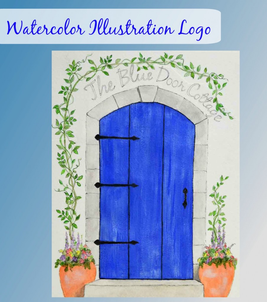
Anyway, a dear blogger friend asked me if I’d do a watercolor logo for her new store, The Blue Cottage Door.
Um . . . me? A ‘logo’? I was more than a bit hesitant until she said she wanted an arched blue door with some vines.
I told her from the get-go I was concerned about the text. I’m not a calligrapher and painting or drawing text has always been my nemesis.
No problem, she said we’d work around it.
After googling a number of arched doors I sketched this and emailed it to her.
We were on the same page.
Now . . . on to the vines around the door.
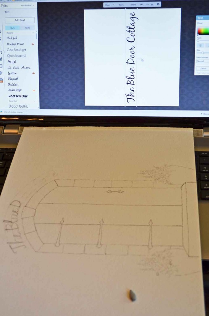
And then I realized before I sketched the vines, I’d have to pencil in the title text to allow spacing.
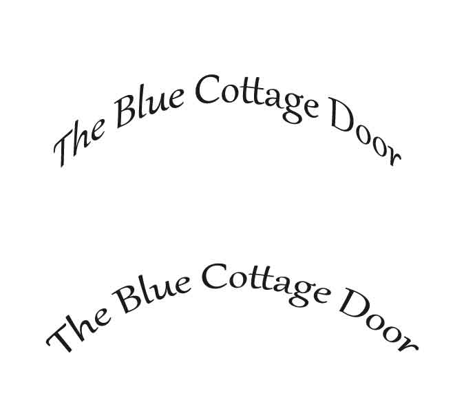
Now, if you’ve never painted arched text, let me show you just one issue you’ll run into – the slant of the letters.
And these are only two options. There are umpteen more, believe me.
It was about this point I was wishing I’d really taken more time to watch some Photoshop videos. Or at least had taken a basic course. Or something.
Point #2 of sketching arched text – if you look at it straight up and down, it won’t work. At least, it didn’t for me.
Turning the sketch sideways, along with the graphic typeface, helped immensely. It’s like drawing upside down – your mind doesn’t try to “correct” stuff the eye thinks it’s seeing.
(If you’ve never tried drawing upside down, you must. You’ll be amazed at how well you can draw when you take your mind out of it.)
Perhaps that explains why I’m drawing more and more these days as my mind is still pretty darn full of mourn-mush, even though emotionally I feel pretty stable.
Point #437 of Grief – You might think you’re doing really well and getting through all the stages of mourning when in actuality, you’re not. Oh, you’re doing well, you’re getting thru each day and you’re making progress but you have absolutely no idea how far you are from being “normal”.
At any rate, turn the image you want to draw upside down, then draw it upside down. When you’re done, turn your drawing right side up.
Prepare yourself because you’ll be truly amazed that you can draw a whole lot better than you ever realized.
Another tip on sketching – there are umpteen kinds of erasers. Who knew? Certainly not me who hasn’t taken a drawing class EVER.
But I saw this kneaded rubber eraser in our little art store here in town after I saw it in an artist’s photo on Instagram. (There are some amazing artists on Instagram and I am nearly obsessed seeing how they draw and paint.)
The thing I love the most about this kneaded eraser is I can pull off a teensy piece, form it into the shape I need to get into a little area and just remove that spot.
What a concept. And oh how much I still have to learn, which absolutely thrills me.
Okay, so, the text got drawn in. Sort of. Then I drew some wisteria and that had been mentioned in a prior discussion.
One thing I do know, after nearly 20 years of doing custom work for clients is that you won’t know how something looks until you sketch or paint it . . . and if YOU won’t know, there’s a very good chance your client won’t know how it’ll look either.
Another reason I wish I was adept with Photoshop.
At any rate, the wisteria was too heavy – we both agreed – and was taking focus off of the main point – The Blue Cottage Door (both the title and the actual door).
Since I already had the door drawn out, I erased the wisteria but this time I placed a piece of tracing paper over the top of the door for the leaves and vines.
My thinking was if this version didn’t work, I’d just toss the tracing paper, and slip another piece over the door and try something else. Which is what I’d done with the wisteria the first time. ahem.
The little Photoshop I do know allowed me to merge the door with the new leaves and vines, get her approval and then I painted them onto the same watercolor paper as the door.
However the blue was too light and she wanted it a deeper, richer blue.
No problem except . . . I already had painted in the black hinges and door pull and with watercolor – unlike acrylic – if you get it wet, it will blend. Meaning, the black hinges and door pull would lighten and muddy the blue wood of the door.
Luckily, somewhere, somehow, I’d heard or read about masking fluid and had it stuck in a box deep in one of my cabinets. And to my surprise, it wasn’t dried up or sealed shut. Phew.
I just painted the masking fluid over the hinges and door pull, let it dry – it’s a sticky/tacky dry – then started adding layer upon layer of blue to the door.
When the blue layers dried, I peeled off the masking fluid to reveal the same black hinges and door pull I had painted before.
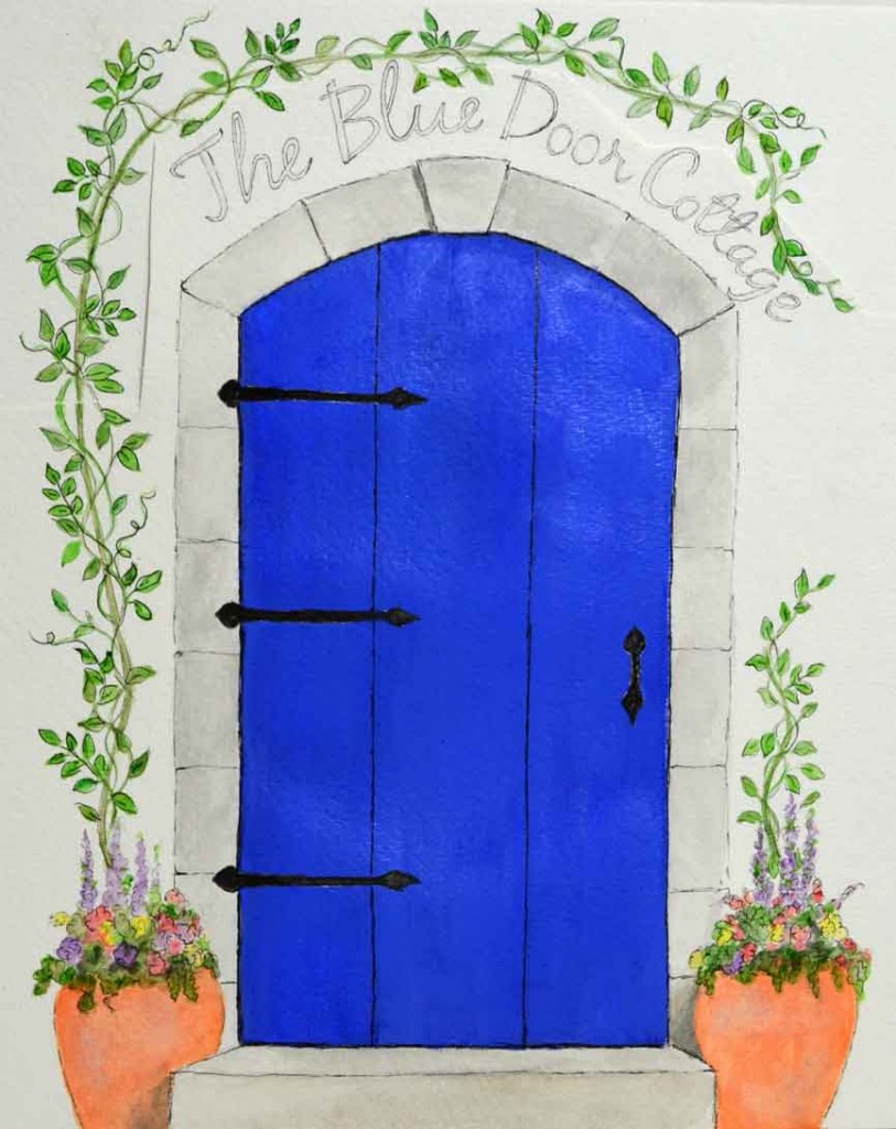
The blue was the right shade but . . . blah. Barbara wanted more of an aged, cottage look.
Even though the painting on the left was done with acrylic and a white wash over the turquoise, I had some fun, this being watercolor.
I wet a brush, and removed a little bit of blue here and there, then added a light white wash over the top.
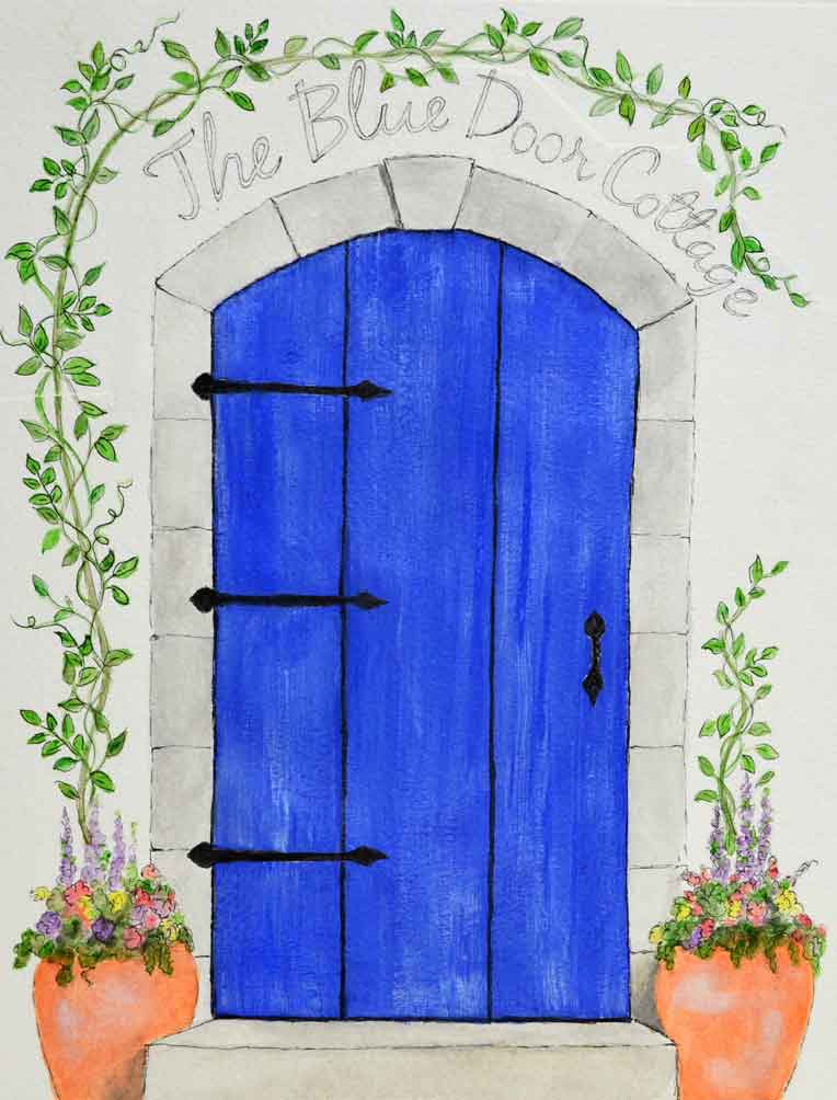
This is what I finally came up with. We agreed that she had someone who would remove the handdrawn text and insert computerized typeface.
But we had our Blue Cottage Door.
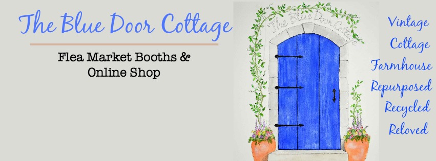
You can find her on Facebook here. She has some absolutely adorable products, definitely worth taking a look.
As far as the watercolor logo . . . it was fun.
I realize I have a lot – a LOT – to learn about watercolor but I truly love it. I’m not giving up acrylic any time soon but you’ll be seeing more watercolors here, along with drawing.
I’m definitely not the most skilled, nor the best teacher in either, but I’ll be honest with my trials and errors as I learn in hopes you might join me.
Of course, if you have any tips or techniques of your own, you’re always welcome to share them here or on my Facebook page. Always.
To my regular readers, I am hanging in there. As you can imagine, losing 3 loved ones in 2 years is overwhelming and life-changing. But rather than sitting idle, I’ve actually been working on building my business – video classes and self-licensing my art. Working a lot. I put together a Business Plan and now am figuring out funding and how to delegate. Oh . . . delegate. That’s a new one for me but it’s the only way I’ll be able to paint and teach and create.
Focusing on the business can take so much time and energy that I find the blog has been neglected. I’ll work harder to get something up here, even if it’s just a sketch or two.
I hope you had a warm and wonderful holiday season and are busy doing what we’re all doing about now – trying to organize and purge our belongings. Ha!
Thank you for your patience and understanding, as always.
Colleen






Oh how fun to see the process and see it come to life. More than anything, I hoped it helped you realize how much you loved painting during this difficult time after losing your mother so soon after losing your Mama. I’m sorry though that my changes gave you such a hassle. But I love it and it is exactly what I envisioned and wanted! xxoo
Oh no, Barb! Your changes were absolutely NO hassle at all! I hope it doesn’t read that way. That’s all part of the process. When I did murals, we’d spend weeks on the planning process. Not a problem AT ALL!
(But I do need to up my Photoshop skills)
Oh, Photoshop…..I finally put getting better at it on the back burner for awhile! My hair was getting too thin from being ripped out in frustration! LOL
I think this turned out so well! The colors are lovely and the vines and flower pots are charming.
I truly believe you are doing quite well considering the last few incredibly stressful years you’ve had and I’ll look forward to whenever you’re able to post. I’m not sure I would be moving at much more than a snail’s pace, given similar circumstances. So please just take care of yourself first and foremost and the rest will fall into place in it’s own time. We’ll still be hanging around!
I am experiencing my own fog and indecision trying to purge the house. Arrggghhh. What a chore! I might need that whatever it is, you know! I am determined to scale down, however.
Have a wonderful week!
Aw, Kris, you’re always so sweet. Thank you. Actually staying busy is really therapeutic – at least for me. I might tend to overdo it (moi?) but I give in then and will take a nap. Deadlines have become not so crucial. I’m fortunate to have understanding and patient clients and not have to work a 9-5 job.
Good on you for purging. You’re right – it’s certainly a chore! But you’ll feel sooo much better when you have a little “breathing” room.
xo~ Colleen
This is such a stunning logo design, Colleen! Congratulations! I’ve never heard of the masking fluid…but it sounds like something very handy to have…on my way to Google it and buy some…so thanks for the tip!
Hey Laura! Oh yes, you HAVE to get some masking fluid. You’ll find all sorts of uses for it, I’m sure. It’s actually liquid latex, or similar, I believe. I never needed it for acrylics but now that I’m on a watercolor kick, it’s necessary. I think you’ll enjoy using it with inks and stamping too.
xoxo ~ Colleen
Your Logo is so pretty Colleen well done !
Thanks Lyn! The more I do watercolor, the more I like them. So I’m definitely playing around with them more – for logos or who knows what!