My favorite thing about painting is making something look realistic. I’ve never even attempted an abstract painting. I have too much fun solving paint puzzles. When you’re a self-taught artist, that’s what they are – puzzles.
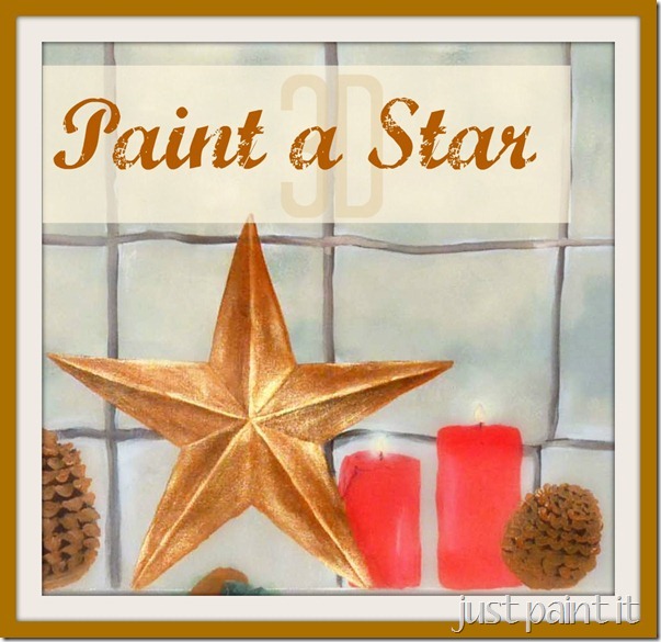
How do you get a flat, non-descript star to “pop” and look like you could feel the ridges and crevices?
“Pop” was my husband’s word. When I started painting 17 years ago, I spent nearly every evening after work painting into the wee hours. Experimenting with darks and lights, shades and tints.
Thinking I had solved the puzzle with, say, greys, I’d get up from the little drop-down table Marlon had made me to wash my brushes before going to bed. He’d walk over to the corner to check out my progress, every night. But he’d never utter a word.
ahem. What do you think, I’d ask, eager for his approval.
“Almost. You’re almost there. It doesn’t ‘pop’ yet.”
He drove me nuts, but he was usually right. The next night I’d start in again, lights, darks. Paint over it and start again. Scared to death to use pure white or true black. But eventually I crossed that bridge too.
And eventually Marlon would approve with a slight nod. Oh, he rarely told me to my face how talented he thought I was. Behind my back? Now that was a different story. He was my “walking billboard”. Only on those I-wanna-rip-this-painting-to-shreds days would he sit me down and give me encouragement.
It was just the way he was.
Maybe that’s why I like teaching so much. Maybe it’s why I like to encourage people who think they can’t paint. I don’t know why, but I’m just as passionate about teaching as I am about solving puzzles.
Which works out nicely, because that makes painting a three dimensional star really easy!
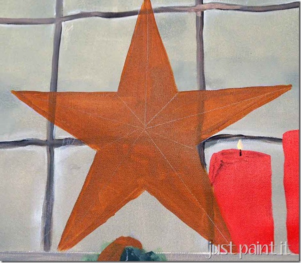
Start by tracing a star pattern and then basecoating it. I used a dollar store ornament as a template and a chestnut brown paint.
When the paint is dry, use a ruler to mark the mid point of each . . . star part. Sorry, I took the bare minimum in science so I have no idea what the pointy-arm-thingies are called. Just line up the end point towards the center.
You don’t need a precise center point on this, ok? Just in case you’re some sort of math whiz, like my brother, or something. Just line the ruler in the middle of a star point and draw a line into the center.
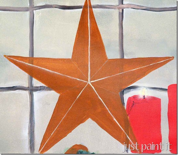
After you do all five points the draw lines from all five inner corners too.
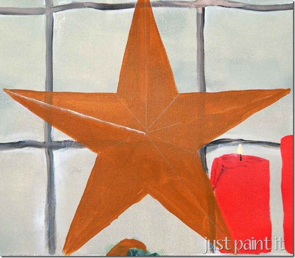
Now, highlight from each point to the center. You might think you’d want to use a liner brush to get a fine line. Don’t. You don’t need precise line.
I use a flat (rectangular) brush with a dab of paint on one corner. (Yes, I’ll be making videos to show you these techniques. Soon.) If you get some uneven parts, that’s fine. It’ll actually look more realistic that way.
All five points highlighted towards the center.
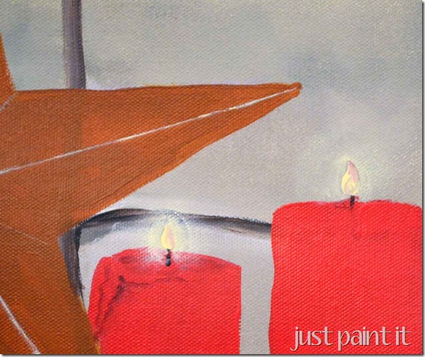
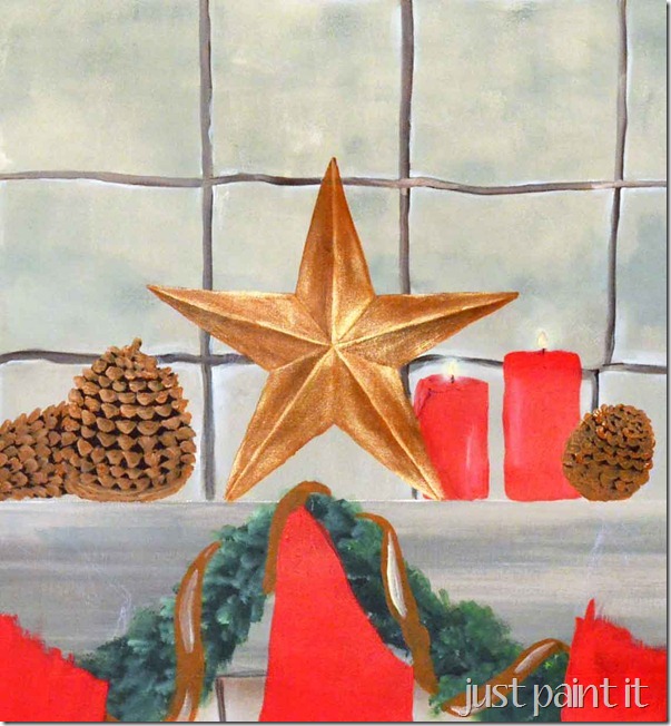
I’m also playing around with a candle flame ‘halo’ on this painting. I’ll let you know later how those turn out.
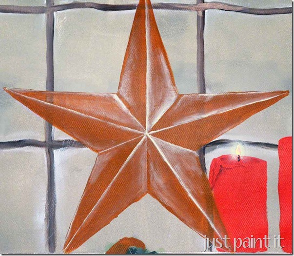
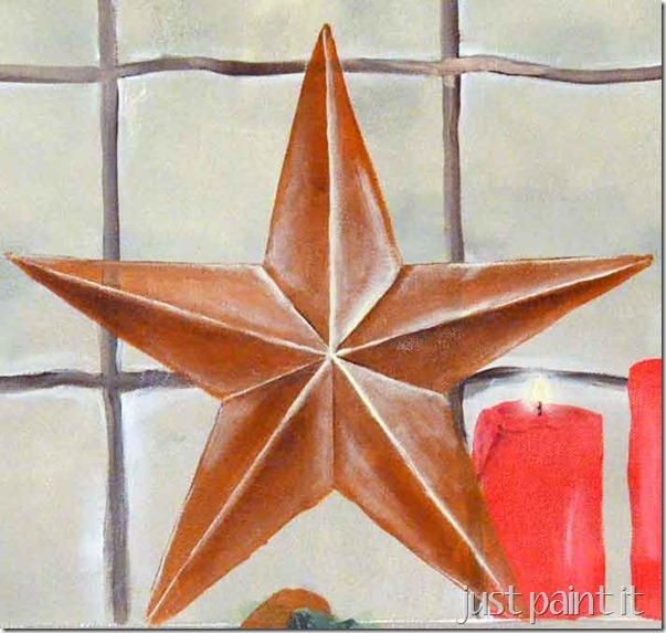
For the rest of the highlighting, start with the lines from the inner corners of the star, using a dab of paint on a flat brush again. You can see where I added areas of highlighting to other parts of the star.
To determine where to put the highlighting I just looked at the dollar store star ornament. If you don’t happen to have one, just follow this pic.
Oh, by the way, I used a light yellow. It looks like white, but it’s a bit softer. White would work just fine though.
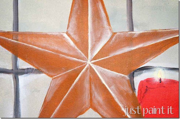
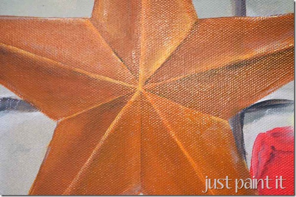
This is just a close up so you can see there’s no real “method” to apply the highlighting. Just dab the paint on there.
To shade the star, take a deep brown and lightly apply to the areas opposite the highlighting. Especially on the inner corner lines. See how the shading makes those areas look more recessed? I didn’t shade the lines from the points as much because I wanted those to be prominent so the shading is further away from the line, into the body.
Play around with it. Highlight, then add shading. Let it dry and take a few steps back to see how it looks. Trust me, I could spend hours doing this. It’s so much fun to what affect a little more or a little less will make.
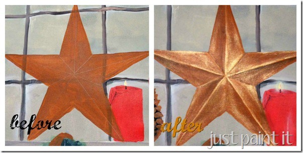
After your shading and highlights are dry, take the basecoat color and repaint the star.
All of your work will still show through, especially when the topcoat is fully dry.
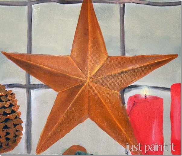
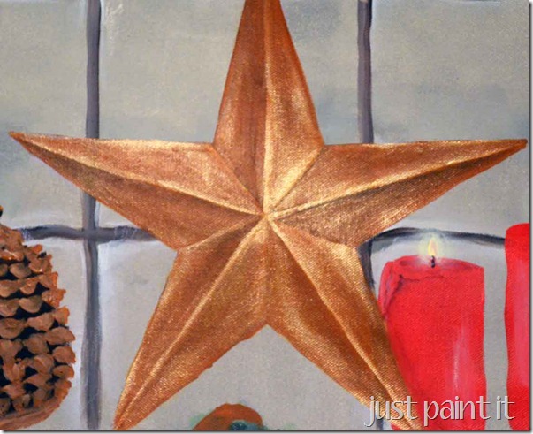
Now, you could stop there, or add a little more highlights, and call it finished. But this is for a Christmas painting with other metallic gold accents, so I made this a gold star.
Have you played around with metallic paint much? Of course it’s great to get an all-over gold look, but I didn’t want to lose the dimension on this star.
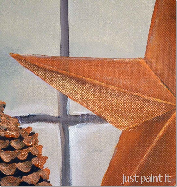
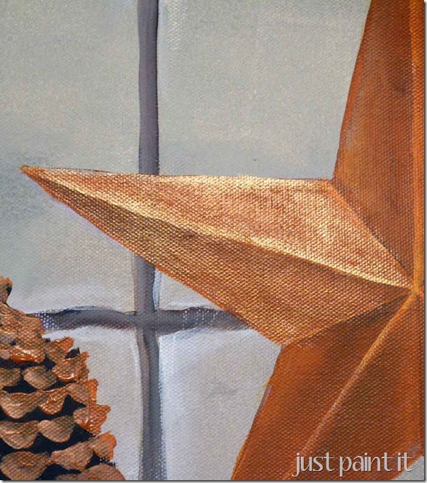
When painting gold over the shaded parts, you don’t want a heavily loaded brush. In fact, you want a very light touch. So you can either use a fairly damp brush and pick up the gold or almost a dry-brush effect.
Boy, it’d be so much easier to show you this in videos instead of trying to explain it. Get ready for loads of videos in 2013, ok?
Moving on. For the highlighted areas, you do want a heavily loaded brush. Remember, wherever you first apply paint to a painting will be the heaviest area. In this case, that would be on the lines along the star points.
Metallic crafts paints tend to flow really easily, which is nice because after you apply it to the highlighted areas you can continue spreading it to the rest of the star without reloading your brush a lot.
So you wind up with a dimensional gold star.
Cool, huh? Do you see why shading & highlighting is my favorite part of painting? Absolutely love seeing something “pop”.
I think my husband was a pretty good teacher. In his own way, that is.
Colleen


Delivered by FeedBurner
ty so much –this is exactly what is was looking for
You are so welcome!