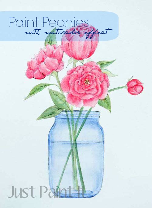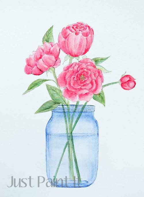
You might have noticed that I’m posting a lot of watercolor projects lately. I’ve painted for nearly 20 years but I’ve never used watercolors. I love the look though . . . the softness, almost gentle appearance of watercolors. And I’m having lots of fun experimenting with this new look.
Except for one thing . . . I’m not using watercolor paints. Nope. Same ol’ craft acrylics that I’ve always used, just thinned with water or floating medium.
I’m trying to label everything with “watercolor look” or “watercolor effect” so as not to mislead anyone. However, my poor pea brain isn’t as sharp as it was when I was in my 30’s. Or even 40’s. So if I miss a label here and there, forgive me and consider the source.
For this painting I used the Peony Pattern I gave you the other day, if you need to download it. Feel free to draw your own though. Seriously. They’re harder to copy than they are to draw your own. Maybe I should do a drawing tutorial too? I’ll add that to the NE list. (never-ending)
Supplies
- Watercolor paper
- Graphite paper*
- Stylus or ball point pen
- Downloaded pattern*
- Micron Pigma Pen .005
- Watercolor Pencils in pink and coral
- Floating Medium*
Paints (FolkArt colors)
- Pink Graffitti
- Pink Melon
- Italian Sage
- Clover
- Lemonade
- Light Periwinkle
*Optional supplies that can be substituted or not used, if desired
To get a watercolor effect using craft acrylics, you’ll need to really thin the paint down. There are a few ways to do it and, really, I use them all interchangeably. It’s more a matter of what you’re comfortable with, as opposed to one method giving a better result than the other. You can:
- wet the paper (watercolor paper only) with water
- dilute the paint with water
- dilute the paint with floating medium
- load the brush with floating medium, then pick up a little paint
- a combination of any of the above.
If you’ve worked with watercolor paint before then you know that you can manipulate the paint even after it has dried. Not so with craft acrylics. Once it’s dry, it stays put. So keep that in mind. Floating medium will give you a longer ‘open time’ than water will, however. If you’re new to painting a watercolor look, I’d probably recommend using the floating medium just so you have more time to move the paint around.
Another consideration with this painting method – you won’t really need darker colors. Shading can be accomplished by simply painting a more opaque layer of paint. Highlighting can be tricky though, if you’re used to using whites. You still can, of course, just paint white highlights. They just won’t have the watercolor effect.
I’m still experimenting with all of this and as I learn, I’ll pass the info on to you.
How to Paint Poppies with a Watercolor Effect
Step 1 – transfer the pattern or draw your line art
Step 2 – lightly ink in the outline with the Pigma pen.
I like to leave a few gaps here and there. After I’m finished painting, I’ll decide whether to go back and ink in more or not.
Step 3 – Leaves & Stems
To get a varied look, paint a little bit of Clover and then come back with some Italian Sage. If you mix them together on your palette, you’ll have one color, rather than a variation.
You’re totally welcome to use one or the other. I just prefer a little more visual interest that’s created with two colors.
Step 4 – Paint first layer of color with Graffiti Pink.
Start with a very light wash, building more color for the ‘inside’ of the petals.
It’s easiest to look at the edge of a petal and paint a deeper layer right next to it.
This ‘shading’ is still diluted, just not as much as the first color wash. I don’t use full strength paint on any of the ‘watercolors’, if I can avoid it.
I’m going to show you this part, even though I covered it up after looking at it for a bit.
I used a dark green watercolor pencil to draw in the leaf veins, then went over them with a damp brush. I though it’d give a nice muted look to the leaf.
It didn’t.
I wound up adding another layer of Italian Sage over the leaves to camouflage the veins. You’ll see at the end that I did, however, draw veins with the Micron.
You might like this look though. I just wanted you to know what I did, in case you do.
Step 5 – Paint a very light wash of Light Periwinkle over the entire jar.
Step 6 – Add some shading with more Light Periwinkle in the areas shown.
I’m thinking about doing a separate tutorial for Mason Jars since they are all the rage right now. They’re pretty easy to paint and I think you could use them for all kinds of stuff.
It’s on the NE list too.
Step 7 – Paint Pink Melon on blossoms for more depth.
You can see I got a little ‘heavy handed’ here and there but I think it adds dimension to the flowers. Just a slight variance in color hue makes such a difference too when working with these light washes.
I highly recommend you experiment on your own, if you’re trying this watercolor look. Try different colors in washes to see how the look changes. It’s really fun!
Step 8 – Add more shading with Peach watercolor pencil.
This is totally optional as I don’t think it makes a huge difference one way or the other but, in the interest of experimentation, it’s awfully fun.
Watercolor pencils are my new favorite toy, even though I’ve had them for years. They just sorta got stuck in a drawer and were forgot about. Now I’m having a blast playing with them and my next piece is almost totally painted with pencils.
Anyhoo, I used the pencil to draw lines in an effort to mimic the veins that are barely visible in petals, going over them with a damp brush to soften the pencil strokes.
Step 9 – Paint tiny little stamen with Lemonade in the center of the open peony. It won’t look like much until you come back with the Micron pen. Which is . . .
Step 10 – Detail with Micron pen. I added a little to the blossoms, the stamen, the stems and ‘veined’ the leaves.
I don’t know why I liked the black veins over the dark green ones, but I did. More of an illustrative look, I guess.
I also took the Micron around the rim of the jar and created a more definitive bottom.
Again . . . experimentation. I don’t know what I’m doing with the ink, and it does give me pause as it’s impossible to cover up any mistakes. Well, except for Photoshop. But I’m just enjoying a different style, both the watercolor and the ink.
What do you think? Are you a fan of the soft watercolors? Or do you prefer vibrant, full on acrylics?
I will say that a friend of mine is a watercolorist and none of her paintings ‘look’ like watercolors. You’d swear they were oils or acrylics, she has so much depth and detail. Truly amazing.
Anyway, this is a fun project for Spring or even Mother’s Day and I hope you have as much fun as I am playing with the watercolor look.
Colleen


Thanks for the tutorial Colleen. The peonies are so pretty and soft looking. Love your mason jar too.
I think it’s beautiful Colleen! I have a set of watercolor pencils and some watercolor paper that I have big plans for!! That’s also on my NE list too!
Nancy
Hey Nancy! Have you used the pencils much? I tend to forget about them but now that I’m on a watercolor kick, they’re getting lots of use. I’d love to see what you come up with!
Thanks for visiting. xoxo
Your post is so good to read. Great!!
Thank you for sharing, I will post it on my Tumblr to share to my families?
Thank you for this lovely artwork. I look forward to having a go. You are
very generous to share your love of painting with us and sharing patterns
and instructions.
Nancy, thank you. I love the fact that you try, and succeed with new ideas. Your post is positive and inspiring. All my best wishes
I’m also a self taught artist, and I’ve painted with traditional oils, then watercolors, then acrylics, then the modern oils, and acrylics again. My favorite paints is the acrylics, but I too love the watercolor look in artworks. After stumbling on this site, I drew with watercolor pencils on watercolor paper, the American Red Breast Robin in an apple tree branch, and I have decided to follow your techniques for the watercolor look for this artwork. I have a blending medium that gives my paints a longer drying time and I am going to use it along with water for the paints. I use it all the time, but I am going to work on getting the watercolor look, by combining all four of your suggested techniques. I love the vibrancy and brilliance of the acrylics, but I am ready for a change, a new look of style in my paintings. Thank you for sharing these techniques with us. Sometimes if we have never had real schooling in the arts, we feel we are not a true artist, but you have taught yourself well, and you are a true artist. I have a hard time distinguishing myself as an artist. Then I hear someone refer to me as an artist, and I’m thinking “ME!”
Hi Rosie, please forgive the delay in my response. I totally understand the hard time we self-taught artists have. I go thru it all of the time but I’m at about the point where I just do what I want now.
I hope you find plenty of inspiration here. I’m now focusing 100% of my time on artwork as opposed to crafts – although with the holidays coming, you never know.
Thanks for your comments. xo