A color wheel for home decor is a simple circle of hues that shows you which colors sit together comfortably and which ones contrast. Use it to pick a main wall color, then choose neighbors or opposites for furniture, art and accents. Once you know a few basic schemes, building a room palette stops feeling like guesswork.
How the Color Wheel for Home Decor Is Organized
The wheel starts with three primaries: red, yellow and blue. Mixing pairs of them gives the secondaries: orange, green and violet. Mixing a primary with its neighboring secondary makes the tertiary colors, such as red-orange or blue-green. A full wheel has twelve steps, and you can read more about its history on Wikipedia.
The wheel is also split by temperature. Reds, oranges and yellows are warm. Blues, greens and violets are cool. For a deeper look at how that affects a room, see our post on warm vs cool paint colors.
Color Schemes You Can Use at Home
| Scheme | How it works | Room example |
|---|---|---|
| Monochromatic | One hue in many lights and darks | Pale blue walls, navy pillows |
| Analogous | Three neighbors on the wheel | Green, blue-green and blue |
| Complementary | Two opposites | Blue walls, orange accents |
| Split-complementary | One hue plus the two beside its opposite | Blue with yellow-orange and red-orange |
| Triadic | Three evenly spaced hues | Muted red, yellow and blue |

Using the 60-30-10 Rule
A useful way to apply any scheme is the 60-30-10 rule. Roughly 60 percent of the room is the dominant color (usually the walls and big rugs), 30 percent is a secondary color (furniture, curtains) and 10 percent is an accent (pillows, art, a vase). It is a guideline rather than a law, but it keeps a room from feeling chaotic.
Building a Palette With the Color Wheel for Home Decor
- Start with something you already own and love, like a rug or a piece of art, and find its main hue on the wheel.
- Choose a scheme: neighbors for calm, opposites for energy.
- Pick your 60 percent color, usually a softened version of the hue.
- Add a 30 percent partner and a 10 percent accent from the scheme.
- Paint large sample patches before you commit. Our guide to how to test paint samples shows how.
Tints, tones and shades
The wheel shows pure hues, but most walls use softened versions. Adding white makes a tint, gray makes a tone and black makes a shade. A muted tone of any wheel color is usually easier to live with than the full-strength version.
Where to Put Bold Color From the Color Wheel for Home Decor
Strong hues are easiest to manage in small doses. A single painted wall, a door or a piece of furniture can carry a vivid complementary color without overwhelming the room. If you are planning a feature wall, browse our accent wall ideas. Neutrals such as whites, grays, beiges and browns do not appear on the wheel, but they glue everything together.
Applying the Wheel Room by Room
Living room
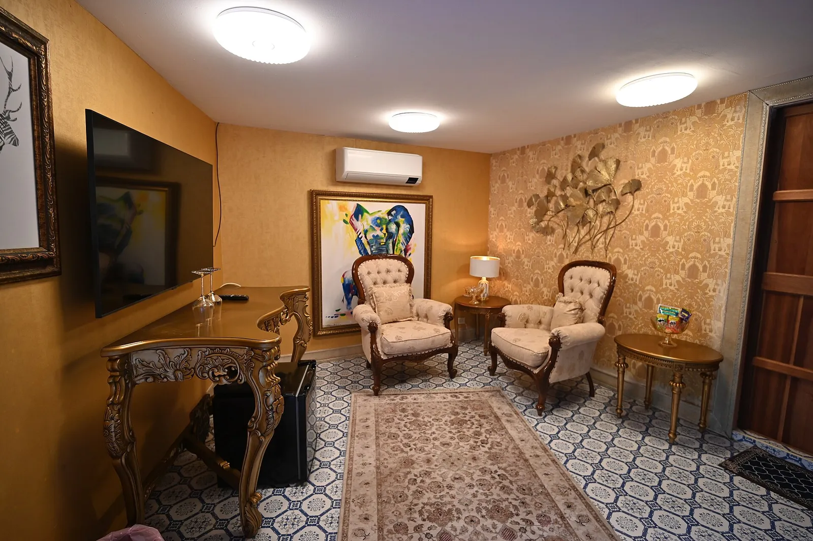
A complementary scheme works well here. Try soft blue-gray walls (cool) with a rust sofa or terracotta accents (warm). The opposing temperatures keep the room lively, and the muted tones keep it sophisticated.
Bedroom
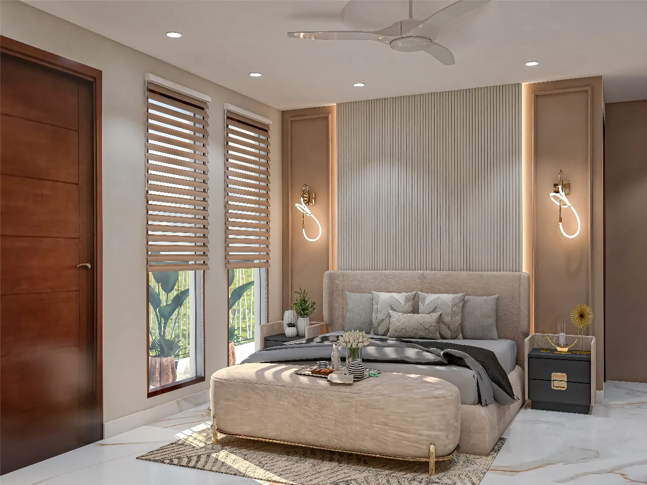
Analogous schemes are the easiest route to calm. Pale green, soft blue-green and dusty blue sit together and feel quiet. Our list of {L((“calming-bedroom-paint-colors”,”calming bedroom paint colors”))} builds on this idea.
Kitchen and dining room
These rooms are social, so warm hues such as yellow, red and orange tones make appetizing choices. Use them in muted forms, such as butter, clay or warm white, to keep the space easy on the eyes.
Common Mistakes With the Color Wheel
The biggest error is using every hue at full strength. A color wheel for home decor shows pure colors, but a lived-in room needs softer versions plus neutrals. Another is ignoring the lighting. Warm bulbs shift blues toward green and cool bulbs mute oranges, so test with the lamps you actually use. Finally, remember that the wheel is a tool, not a rulebook. If a combination feels right to you, trust it, and use the wheel to fine-tune the proportions.
Safety Note
Open windows and keep air moving when you paint, and choose low-VOC paint if possible. Wear a mask when sanding.
If your home was built before 1978, the existing paint may contain lead. Use an EPA-recommended lead test kit before sanding or scraping, and follow lead-safe work practices if the result is positive (see the EPA renovation and painting guidance).
Frequently Asked Questions
How does a color wheel for home decor help me choose?
It shows which colors harmonize and which contrast, so you can plan walls, furniture and accents on purpose.
What are complementary colors?
They are colors directly opposite each other on the wheel, such as blue and orange. Together they create strong contrast.
What is an analogous color scheme?
It uses three colors next to one another on the wheel. It feels harmonious and is easy to pull off.
Do neutrals belong on the color wheel?
No, but they pair with everything. Their undertones still lean warm or cool, so match them to your main hue.
How many colors should a room have?
Three to five including neutrals is a comfortable range for most rooms.