My love affair with poppies started when I was a Brownie in 2nd grade. We took a day trip and planted California Poppy seeds all over a hill.
I have no idea if they ever bloomed, but every time I see a golden poppy I go back in time.
The trend lately has been rich orange oriental poppies. I love the orange, but I needed these in pink to accompany a fairy.
More on her tomorrow . . .
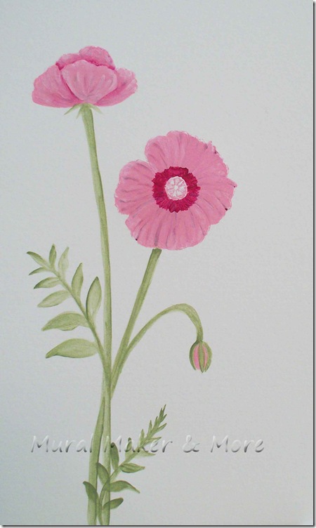
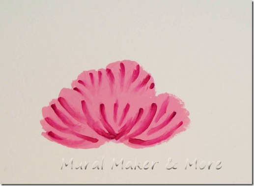
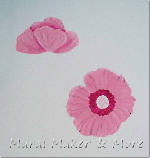
This tutorial has two blossoms. The top one is a side view and the bottom one will be fully open.
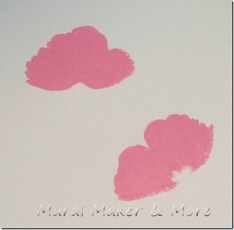
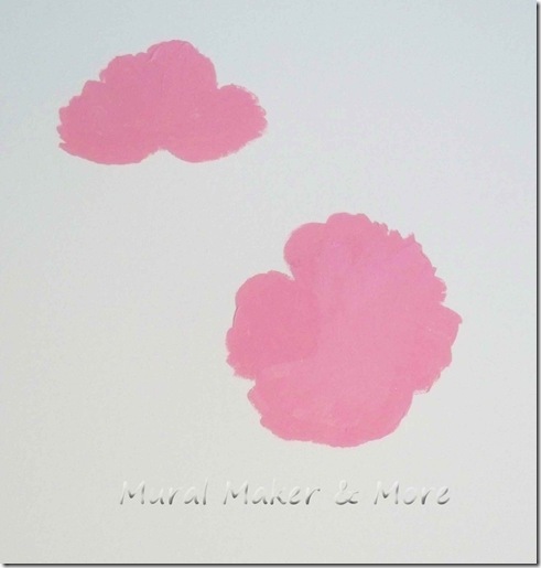
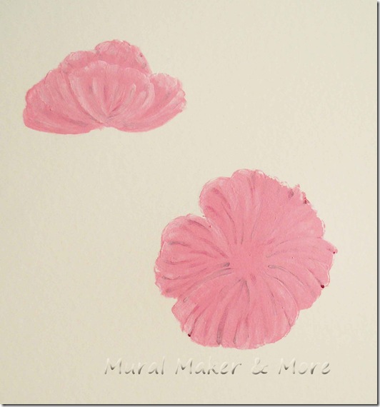
For the top blossom, take medium pink and paint four or five ‘ruffled petals’. The more curves on the top of the petals, the better.
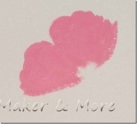
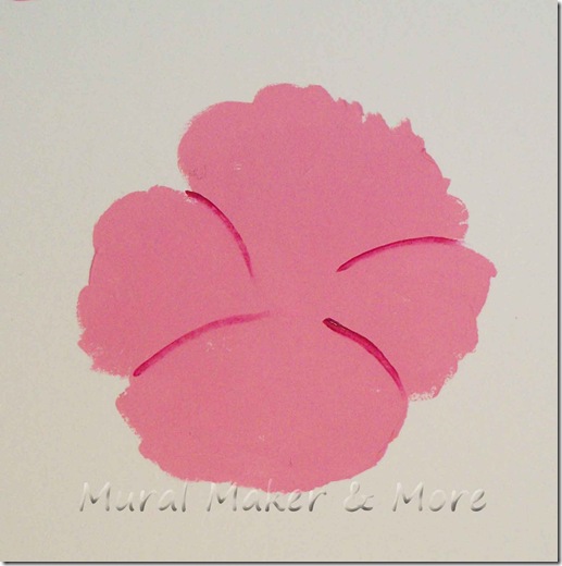
On the lower blossom, you’re going to paint four or five petals, but around a circle.
The curves on top of the petals shouldn’t be symmetrical. You want them uneven.
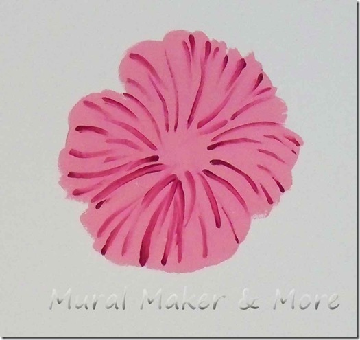
This looks pretty scary, doesn’t it? I forget that because I already know where we’re going. But in class last night my students actually gasped when they painted the shading layer. I turned around as they all looked aghast at their papers and tried to reassure them that they really and truly would get a pretty painting by the end of class.
They did, too. And they were happy.
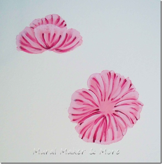
So, hang in there with me and take a dark pink (fuchsia) and add little curved lines.
On the open blossom, first add curved lines where you want the petals to overlap.
Then add curved lines to each petal. Paint some from the center, moving outward. And paint some from the outer edge, moving inward.
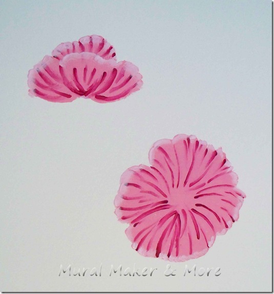
Now . . . I’m gonna show you these pictures so you’ll know that these tutorials don’t always turn out on the first try. Or second.
I used a very light pink and highlighted the very edges of each petal.
Then I used the same light pink and added curved lines next to the fuchsia curves.
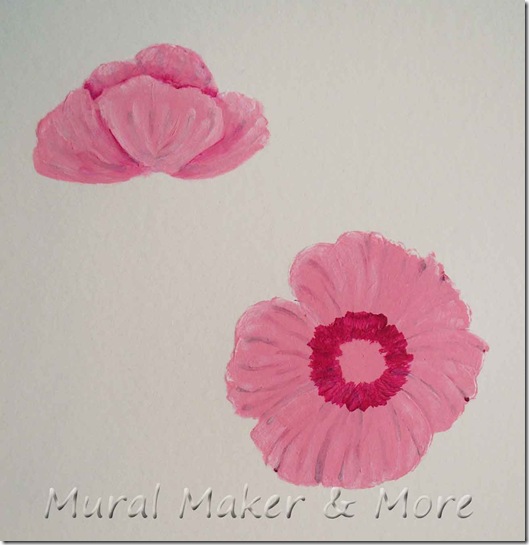
Then I topcoated the top blossom with medium pink.
And none of the light pink highlighting showed up.
Blech!
Plan B . . .
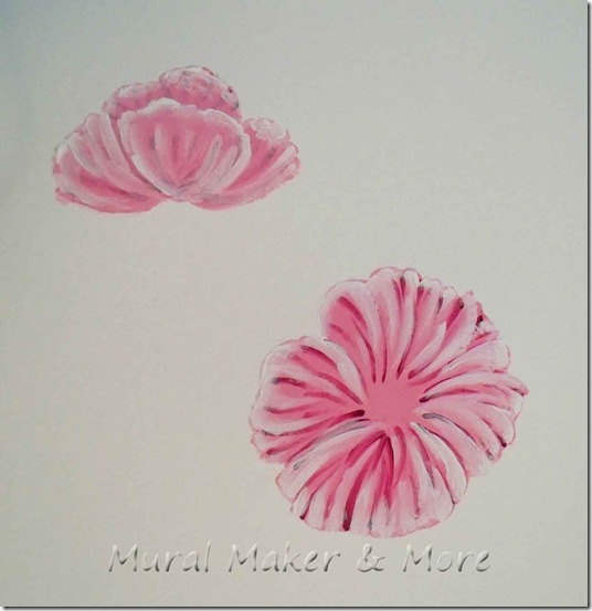
Take white paint and highlight the outer edge of each petal and paint curved white lines on the body of each petal.
Now when you topcoat with medium pink you’ll see the highlighting peeking thru.
It’s more noticeable on the upper blossom in this pic.
Here’s a little tip for topcoating: you don’t need to water down the paint, or add a glaze, but you also don’t need a really thick coat of paint either. Start light and add more paint if you need to camouflage any highlighting or shading strokes.
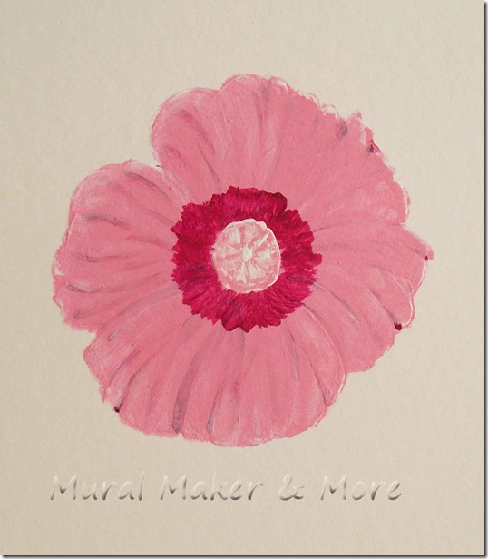
Dab fuchsia in a circle in the center of the open blossom. Dab, I say! That way you’ll get an uneven appearance.
Now you can paint a white circle in the center.
With medium pink, paint little spokes, like a wagon wheel, on the white center.
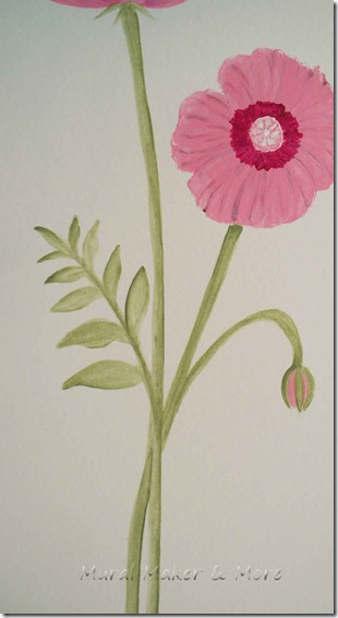
You can get away with just one shade of green for the stems by thinning the paint with a little water or gel.
Paint your first coat really light. If it’s too dark in areas, wet your brush, blot it on a paper towel, and ‘erase’ the area that’s too dark. This works as long as the paint is still damp.
If you want some shading, just go back over the stems with paint that hasn’t been diluted.
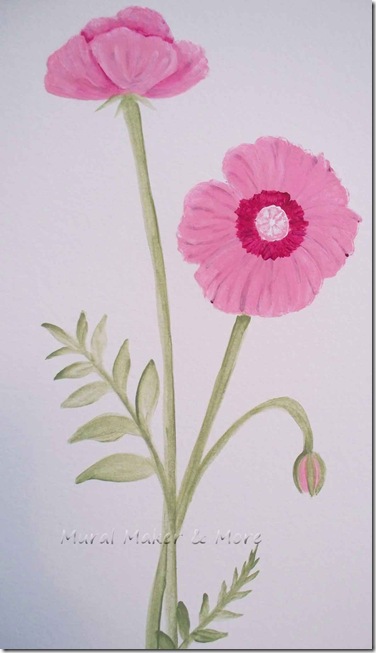
The leaves are little curved stems with graduated petals.
And that’s a couple of simple poppies using the layering method. With four colors of paint – medium pink, dark pink, white, and a grey/green.
Tomorrow I’ll paint some more using a wet-blend method. That is, if all goes as planned.
Which lately hasn’t been happening too much.
But one can always hope.



[…] Poppies […]