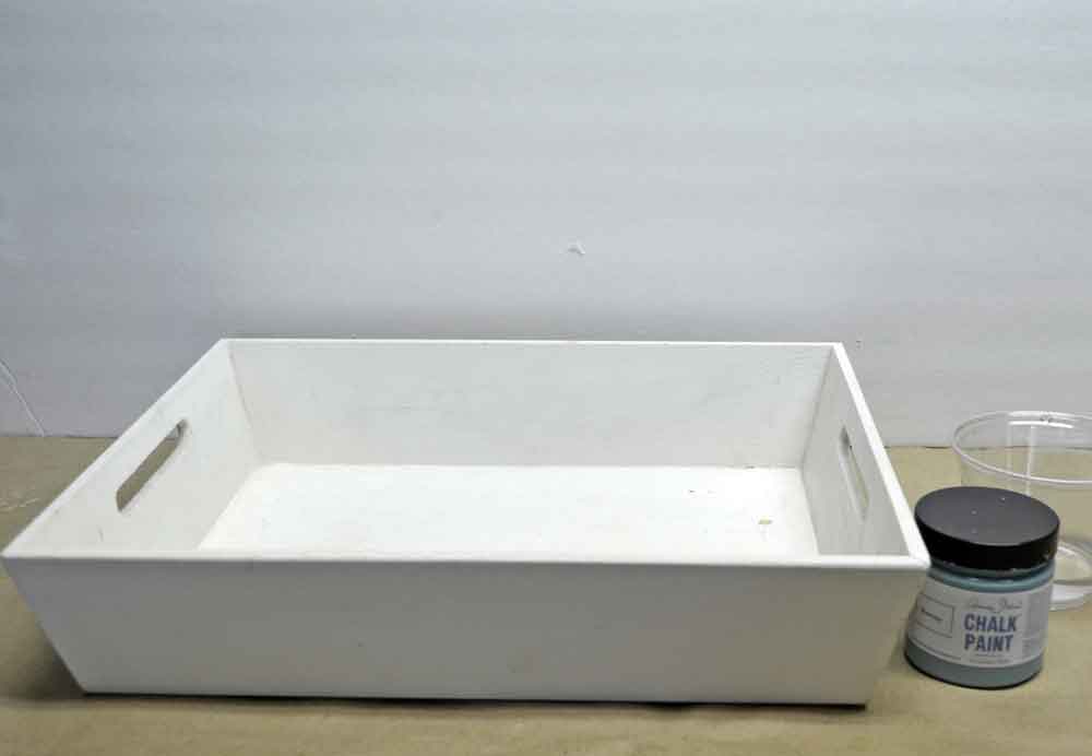
 I’ve carted this $2 tray around for a number of years, saving it for I-don’t-know-what. Keep in mind I already have a number of trays so it’s not like I needed another one. Not to mention I wanted this for my coffee table in my living room where I’m bringing in turquoise accents and I have two turquoise trays that would probably work just fine.
So there was absolutely no reason to paint this for the living room other than I just felt like it.
And . . . I’ve also carted a piece of scrapbook paper around that my mother happened to love. While I never got around to doing anything with it when she was alive, there’s some comfort when I look at this tray now.
(Kinda weird, but my whole life went haywire 3 years ago when my hubs died unexpectedly so I’m quite used to little signs and symbols bringing my loved ones to mind.)
Anyway, do you wanna see how to do a colorwash on wood with Chalk Paint? I’ll give a little disclaimer before we get started: it didn’t quite turn out the way I thought it would.
 I had a teensie little bit of Chalk Paint in Provence {affiliate link} left over from the desk I painted last year . . . which is why I decided to do a color wash. I didn’t think I had enough paint for the whole tray.
Wrong.
I poured a random amount of water into a cup and probably less than a teaspoon of paint. I should’ve done the reverse and put a few drops of water into the paint.
You see, the color Provence was a perfect match to the scrapbook paper. Perfect! And so I thought – logically, or perhaps not – that if I diluted the paint with water I’d get a lighter tint of the hue. But I didn’t. Maybe I would have if I’d added more layers, I dunno.
You’d think after all of these years playing ’round with paint, I’d know better. Huh-uh.
 This is after one application of color wash.
Very, very light.
 After two layers.
I left it like this for two reasons: 1) I liked seeing the ridges of the wood and 2) I was too impatient to add another couple of layers.
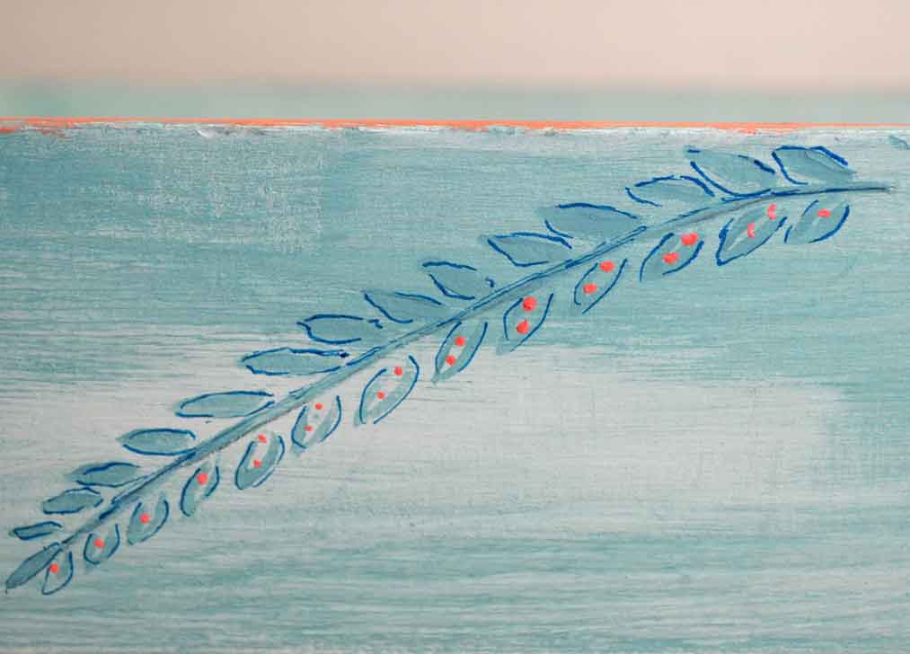
 I originally intended on stenciling the sides of the tray but I saw these leaves in the pattern of the scrapbook paper and decided to give them a shot.
With full strength ASCP Provence.
 When I first showed you my living room with the turquoise accents – and the tray and paper – I mentioned that I might bring a little peach or coral or poppy into the room too.
I could’ve sworn I had the perfect paint color. I mean, I’ll be the first to admit that the majority of my house is in major upheaval because I’m packing some of Mom’s stuff, moving other stuff around, etc., etc., but my paint?
My paint is organized – by type of paint, in bins by color (unless I’m working on a piece, then I put those colors into a little bin to keep them together).
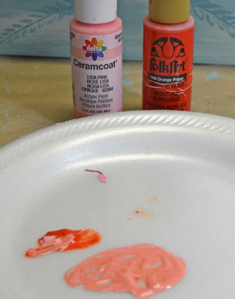
After searching for the ‘missing’ Poppy, I looked at the really, really orange bottle in my hand and there it was – “Orange Poppy”. sheesh. So I grabbed a bottle of Lisa Pink paint {affiliate link} and mixed a couple drops of Orange Poppy {affiliate link} into it.
I do much better mixing paints then mixing paint washes apparently.
 Just a little on the top edge of the tray. Oh and btw, if you like a little gradiation in your paint, don’t mix your colors completely. Then you’ll get a little darker here, a little lighter there.
A little tip – when decoupaging, take your color into that space a bit. Ok, I overdid it, but I’m not the best paper-cutter-person.
 You probably already know there is a wide variety of Mod Podge formulas now but I’ve always used the regular MP. I found this in my adhesive stash for paper and since my podging skills are right up there with paper cutting, I wanted to give Paper Mod Podge a try. {affiliate link}
(I even read the directions.)
 However, while I was waiting for the Mod Podge to dry, I looked at my painted leaves.
Meh.
Right color? yep. But still not enough depth to complement the scrapbook paper.
 Out came the Sharpie.
Years ago, maybe 6 or 7 now, I spent a pretty penny and got a huge color selection of Sharpies. {affiliate link} They sat in the drawer for years. Not any more. I use them all the time.
 And yes, it takes guts to take a permanent marker over something you just painted. No, my markings aren’t perfect . . . far from it. Yes, my hands shake and I get squiggles where I didn’t want them.
 But keep in mind nobody is going to look close up. Well . . . not in front of you, at least.
It’s a style thing. You might prefer plain acrylic or plain watercolor paints. Sometimes I do too. But sometimes I like a little definition – or in this case, some depth of color.
At any rate, give them a try. I think you’ll like them for some of your projects.
 By the way, no bubbles with Paper Mod Podge.
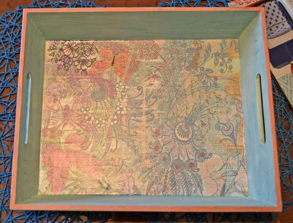
And the yellow cast is from the incandescent lights in my living room rather than my full spectrum light in my studio.
 All in all, the tray turned out pretty cute.
But the color wash?
 I’m not so sure. I do like the effect, but I’d prefer a richer color (like the other two I already had).
But then, I’m not done with the room either.
 One thing I know for sure – I’d have a hard time picking all the finishes in a new house, envisioning how they’ll work together – or not.
No, I’ll just happily continue watching HGTV and keep playing with my paints.
Colleen

I really like your tray! The color really goes great with the paper and the poppy accent and popping the leaves with the sharpies made it perfect! Thanks Colleen!
I think the tray turned out great!
Your tray is beautiful!!